Author: Brian Dys

  • In Malate

    Did I mention that my math superpower in high school failed to work during my stint in the College of Engineering? My parents’ chosen course for me was ECE. I wrote mine in the second choice field: Creative Writing.

    For a year, I managed to trudge through the hallways and classrooms of Velasco. In between schedules, I worked as an SA (student assistant) at computer laboratories—the job took me places (read: other buildings). On Saturdays, the sunny soccer field was my home as a medic in ROTC. These were the places in my world in DLSU.

    Never thought of wandering past the library. Never dared to stop wearing plaid polo shirts.

    During the last term of my first year, the course I was in felt like chains and balls shackled to my feet. Depression kicked in that I found myself breaking out in tears in a Philosophy class. The prof was sharing about her journey in Zen and at some point I was sure she was talking directly to me about finding freedom and peace.

    Paradigm Shift

    Armed with an SLR and some knowledge in Adobe Photoshop, I shifted to Advertising Management (after finding closed doors in Communication Arts)—did all the paperworks and passed the qualifying exam. Then I told my parents about it. I don’t remember that it really mattered to them—the sin that I did. They were full support in my education, I realized.

    One lazy afternoon, along the walkway of SJ Bldg. were recruitment booths lined up left and right. I was looking for a place where I could contribute in photography and graphic design and there I found LaSallian and Malate. Or they found me?

    Resident Photoshopper

    Just some of the works I unearthed from an old hard drive:

    Malate Literary Folio - Recruitment Flyer 2002
    A Malate Literary Folio Recruitment Flyer.
    Lilt And Verve Ticket - 4 October 2002
    A Malate Literary Folio Lilt and the Verve event ticket.
    Malate Literary Folio Bookmark - 2003
    A Malate Literary Folio giveaway bookmark.

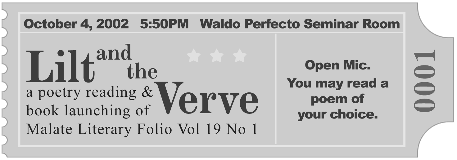
    Other works include cover design of a couple folio issues, published photographs (of course) and some written works in a logbook—beaten and left for dead by legit poetry members.

  • Are UI and UX design the same for websites, apps, and physical flyers?

    If it stemmed from the same campaign, they all could have the same objectives.

    Only at the Structure level—specifically, Information Architecture—they could be the same.

    For the interface (UI), the differences are obvious—that as of this moment, physical flyers can’t handle HTML yet.


    Originally published in Quora

  • Offshoots

    Shutter Click Number One
    A portrait of Brian Dys taken by a salesman at Mayer Photo. 15 November 2005.

    My money allowance in college—they all went to the photo shops for films and development. I started shooting black and white because they were cheaper at thirty–six shots, 200 ISO. It was sufficient back then—having thirty–six in the roll. Having a couple or more rolls would take months to expose.

    Only precious moments were captured and the moments captured became captivating.

    Etched in my memory until now was the dream I had of having a digital camera—yes, unlimited shutter clicks. It was a feeling—no, more like a longing—in my waking life that manifested itself one night. I woke up in frustration—of only dreaming, of not having.

    Imagine the possibilities was the only thing I could think of. Imagine the possibilities of never having to curtail my favorite moments.

    The results were endless offshoots—photos that were not five–star material yet not fit for the trash bin either. So they get exported into a lower resolution for easier archival.

    Maybe one day, future me would match the feelings of those blurred and unkempt slices of life. Scarcity, then, would not only be about quantity but about time incapable of rewinding.

  • NTT Is an Approved WP Theme

    What a great news for the start of September—I received confirmation that NTT is already in the WP Theme Directory.

  • Are You Game?

    Recently, the team is delving into gamification—ultimately, towards user engagement. Glad to have encountered the ARCS model of instructional design which is similar to the engagement loop.

    ARCS stands for: Attention, Relevance, Confidence, Satisfaction—which could also be an engagement loop in learning.

  • Framed Up

    I still could not wrap my head around the whole idea of frames. However, I did like the structure that was described in relation to linguistics.

    • Surface Syntactic Frames – verb and noun structures
    • Surface Semantic Frames – action–centered meaning of words
    • Thematic Frames – settings
    • Narrative Frames – stories

    We could notice the structure—from the detail towards the bigger picture. Patterns like these are also relevant to Information Architecture.

  • Using as Placeholder Attribute

    How about applying the DRY Principle in a user interface?

    One method is by using a single element to have multiple functions. In the case of a <label> and a placeholder attribute in a <form>, we could simply use the <label> to be the only label of a particular field—as opposed to having two.

    Besides, their main functions are to tell the user what field it is and what it expects as a user input—so why not optimize it?

    Regarding its accessibility, please read an 2010 article from WebAIM and a recent one from Smashing Magazine.

    Here’s a quick PoC. Try focusing on a field and see the label move.
    <p class="codepen" data-height="300" data-theme-id="1820" data-slug-hash="YjowRP" data-default-tab="result" data-user="BrianSahagun" data-pen-title="Using

  • Learnings and Reminders

    The minimum size of an Active Area (AA)

    Ideally, it is 48 x 48 pixels. However, there are elements that needs to be smaller in relation to other elements with it—with this consideration, we could go down until 32 x 32 pixels.

    The cohesion between two UI elements

    In order to show cohesion and relation between two UI elements, we could use proximity—place the element near each other. However, when there are more important considerations like if space won’t permit one element to be there, we could use motion to cue that those two elements belong together.

    Recency

    The elements in relation to the user’s “now”.

    Contextual

    Elements that are there only when you need it and also there when you thought you didn’t need it.

    Numbers 3 and 4 fall under Relevance.

    Outcomes Over Features

    The outcome most teams are aiming for is a change in behaviour. The outcome you want will depend on your business or organisation: it might be selling more dog food, getting people to sign up to a monthly donation to your charity, or opting for mediation over court in their separation. Source

    Shareability of Content

    When deciding the number of characters an item could have, consider thinking about it being in other platforms.

  • Defining Elements in a User Interface

    There could be two approaches in defining elements in a User Interface (UI):

    • Sentence
    • Label

    Say, for example, we have a blog post that has a date. In order to define what kind of date it is, we could either define it in a sentence:

    • Published on 1 January 2020.
    • This blog post was published on January 1, 2020.

    or we could define it thru a label:

    • Date Published: 1 January 2020
    • Publishing Date: January 1, 2020

    Please note that in order to create an effective description that communicates its purpose, we have to identify the context in which the element is in. (more…)

  • When should I use a single-column and multi-column timeline feed?

    What kind of content are you presenting?

    Take a look at Facebook feed and Pinterest feed.

    Facebook feed presents a variety of content—text, images, videos whose purpose are to update the users of current events and happenings in their friends’ lives.

    Pinterest feed, on the other hand, presents content heavy on images—eye candy if you may.

    So for timely content like news, it’s best to present it linearly (single–column) beginning from the most relevant and recent.

    For content meant to be browsed or scanned, it’s best to present it all at the same time (multi–column), of course also beginning from the most relevant to the user.

    Relevance is key.


    Originally published in Quora