Discovery has always been part of our experience in using web sites and apps. They could be in any form:
clicking an ambiguous icon to find out what it does
going through multiple pages to find information
finding out what’s causing an alert icon beside a label
learning and memorizing keyboard shortcuts
…and the list goes on.
One UI element that helps us in most discovery processes is the tooltip. Users of Windows or Mac have surely encountered it when you hover your mouse cursor on certain items in your computer desktop (maybe by chance or out of curiosity if you don’t want to click something). It is in the form of a box with text label or description.
The Elements of Style Sheets aims to categorize CSS properties into three elements: Nature, Theme, and Layout. It could help a front-end designer’s mental model of building the CSS on top of HTML.
Nature
Nature refers to the individual characteristics of an element.
Display (display)
Dimensions (padding, width, height)
Theme
Theme refers to the visual design of an element.
Colors (color, background-color)
Typography (font-size, font-family)
Decor (border, border-radius, box-shadow)
Layout
Layout refers to the relationship of elements with one another.
Position (float, position)
Spacing (margin)
Update
Animation
As an example, after building the Content Structure in HTML, the front-end designer, in a mobile-first approach, will focus on styling individual elements – by their Nature first (usually, width is set at 100%). And then style according to Theme and lastly, as the viewport goes wider, the front-end designer styles the Layout.
An action and a reaction that goes back and forth between entities is interaction. Here are simple examples of interaction between a user and computer:
you press the power button of your mobile phone and it causes the screen to light up, showing a pass code input screen
you input a pass code and the mobile phone unlocks, showing the home screen
you tap a particular app icon and you are shown its information
It is worth noting that the last item is one of the simplest forms of interaction in web sites and apps – you tap an app icon and it opens or you go to a URL and the web site appears; it presents information and you consume it. Think of link surfing in Wikipedia – you simply activate link after link and consume the information available in the articles.
Of course, added web site or app features provide for more interactions other than purely presenting and digesting information. Take for example 9GAG – instead of textual information, the user could consume textual and visual information, upvote, downvote, comment, and share memes.
Elements of Interaction
The Elements of Interaction aims to categorize the actions of the user while interacting with web sites and apps.
Task
A task is a work done by the user. It is usually direct to the point. For example searching for the keyword “alpaca”. Given that you are already on google.com, this entails inputting the word “alpaca” into the search bar and activating the search button.
Screenshots of google.com showing a task of searching for the term “alpaca”.
Activity
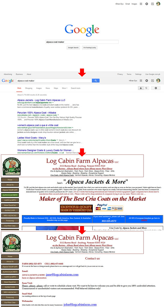
An activity is composed of several tasks. For example, contacting the best alpaca coat maker on the internet. Now, apart from doing the task of searching for the keyword “alpaca coat maker”, there are several tasks entailed in this activity such as reviewing the descriptions of top search results, looking for ratings, trying to visit all top five search results, picking the “best” according to your criteria, and finally, getting hold of them thru any communication channel available (contact form, chat, email, or phone).
Screenshots of google.com and logcabinfarm.com showing the process of searching for the terms “alpaca coat maker” and visiting the top search result.
Behavior
A behavior is a user’s particular pattern of usage of a web site or app. This particular element of interaction creates a space for special cases that varies from user to user.
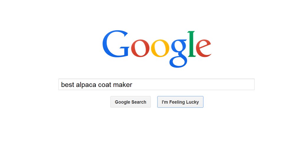
From a low-level perspective, a user might have a peculiar way of accomplishing tasks or activities. From the example above, a user’s behavior in searching might be to go directly to the top result by activating the “I’m Feeling Lucky” button.
A screenshot of google.com showing the button “I’m Feeling Lucky”.
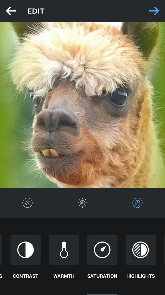
From a high-level perspective, the user might have a peculiar way of using a web site or app which could be not the main purpose of the web product itself. For example, some users use Instagram only for editing pictures but not posting them to Instagram.
A screenshot of Instagram Android app showing the Edit Screen with a handsome alpaca as the image being edited.
Conclusion
The Elements of Interaction puts the context in Elements of Information Structure. It puts the connections among the objects and components in a user interface based on how users might use the web site or app.
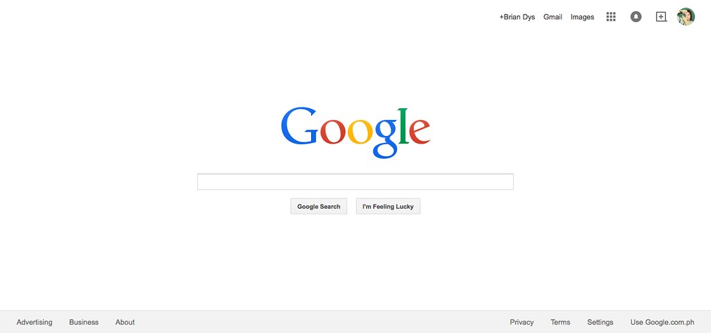
In this post, we will discuss Elements of Information Structure. We’ll use google.com as an example to demonstrate how information is structured in such a way that all its elements are identifiable in singles and in groups.
A screenshot of google.com’s home page.
Elements of Information Structure
Contents of web sites and apps can be called “information” – these are words, phrases, symbols, and any representations of elements that give meaning to the user. All information, to be effective, must be properly structured. Imagine a web site that does not show easily the information the user needs – that web site might need to restructure its information by prioritizing the more important ones or what the users usually need.
Object
An object is a singular element.
Illustration 1. Objects are highlighted on google.com screenshot.
Note: Some Objects are generalized like in the Navigation Items above. There are several components there (e.g., Apps, Notifications, Social, and Admin) which are listed generally as “Navigation Items”. Ideally, another illustration could show these interactions but for this post, we won’t go into that level.
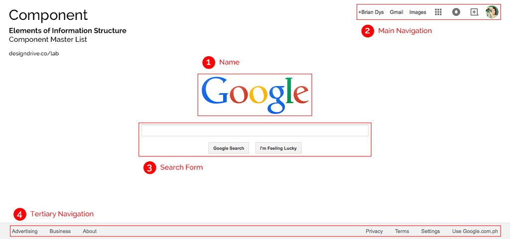
Component
A component is a combination of more than one object.
Illustration 2. Components are highlighted on google.com screenshot.
Note: Name is considered a Component due to its HTML markup grouping wherein the Name Component could also contain taglines and other objects related to the name of the web site.
Container
A container is a UI element that contains objects and components. Examples of containers are pages or screens, dialog boxes, pop-overs, and panels to say the least. Container is very useful during interaction because it defines the confinements of the information that will be shown or hidden from the user’s view.
Illustration 3. Container type is page.
Constructor
A constructor is a default section in a web site or app. Generally, these three constructors apply to all web products: Masthead, Content, and Colophon. The Masthead contains the name of the web product, the main navigation and search functionality; the Content, well, contains the main content; the Colophon contains additional information of the web product.
Illustration 4. Constructors are highlighted on google.com screenshot.
Sub-Constructor
Updated One example of a sub-constructor is a sidebar which attaches to any of the three constructors. Sidebars are denoted by the HTML tag <aside>. It contains and supplementary information, widgets, and plug-ins.
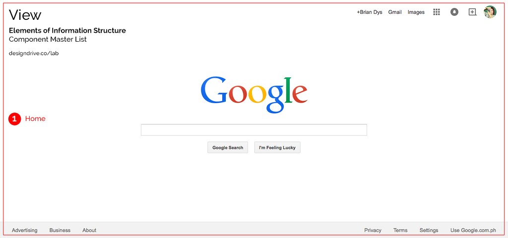
View
A view is an instance of the web site or app. Usually this is also the name of the current page or screen container the user is in. It basically answers, “What page or screen is the user currently viewing?”
Illustration 5. View is highlighted on google.com screenshot.
Conclusion
Each red label in the illustrations above can be used as official names of the objects and components. Team members working on the same project will now have a standard name for components and this could lessen the confusion when referring to the said components.
In general, label and icon combination is helpful in making an action easier to remember and depict.
Take a look at the left menu of this WordPress Dashboard:
WordPress menu labels with icons
And when there are no icons:
WordPress menu labels without icons
Without icons, you would need to read the labels one by one until you see what you’re looking for. The icons beside the labels definitely ease the effort in reading and recognizing the actions.
The Content Structure
How do we design the label and icon combination? First question we have to ask: with only HTML, is it important to represent the icon? For example, should it be contained in img, span, or a special character (think: icon fonts)?
If your answer is the same as mine, which is: only the text label is important enough to be represented in HTML, then we could simply use a to contain the label; the icon would be displayed using background-image.
Let’s use “Settings” for example:
[codepen_embed height=”102″ theme_id=”1820″ slug_hash=”EawKOb” default_tab=”result” user=”BrianSahagun”]See the Pen Label and Icon Combo by Brian Dys Sahagun (@BrianSahagun) on CodePen.[/codepen_embed]
The HTML Anchor Element <a> should also stand for “action” since its use is very powerful from being a simple hyperlink to being an element that performs a specific action. Think icons in web apps that are <a> underneath the HTML markup.
You might have a 16×16 px icon for a toolbar action item – but is 16×16 px active area enough to be properly activated? Perhaps for a desktop device with a mouse and pointer. But for touch devices, we must ensure that our action elements are comfortable enough for the average human fingers or thumbs. This goes without saying that bigger active areas are easier to point at and activate than small ones.
The recommended size of active areas (or hit targets) for iOS is 44×44 px and 48×48 px for Android. This ensures that users could comfortably tap or click on active elements such as icons, lists, and buttons.
Increasing the Active Area Thru Padding</h3
Now, padding doesn't literally mean CSS padding – although we could also achieve it that way. For our examples below, we will set the active area of a 16×16 px icon to 48px thru the width and height CSS properties.
[codepen_embed height=”638″ theme_id=”1820″ slug_hash=”zxdPBJ” default_tab=”result” user=”BrianSahagun”]See the Pen Action Padding by Brian Dys Sahagun (@BrianSahagun) on CodePen.[/codepen_embed]
Example 0 – Without Padding
This example shows if you have a small icon and you simply leave it as is. The active area is small enough to target/activate.
Example 1 – With Active Area of 48px
We increased the size of the <a> element to 48×48 px thru width and height CSS properties. As you can see if you hover your mouse, the active area is bigger and easier to target/activate.
Example 2 – 16px Sprite Image with Active Area of 48px
This example shows the icons having sizes of 16px and active areas of 48px.
Example 3 – 48px Single Image Resized to 16px Thru CSS with Active Area of 48px
The benefits of having a larger image (48px) which will be used as a smaller image (16px) are:
you can resize it later to a bigger image (but not bigger than its original size) without losing quality (see Example 5)
the icon can accommodate hi-res displays – meaning it won’t show pixelation (up to a certain size only – depending on the original size)
Example 4 – 48px Sprite Image Resized to 16px Thru CSS with Active Area of 48px
There are several CSS considerations when using sprite image being resized from its original size.
First, since a sprite image has multiple images in it and you only need to show one image for each element (and avoid showing parts of the adjacent image), we need to set up a separate element that will contain only the background-image. In this case, the <span>. On the other hand, the <a> will contain the dimensions of the active area.
Second, we have to set the <span>’s display property to inline-block so that we could control its horizontal and vertical alignment within its parent element (which is <a>). Remember, since the icon’s size is smaller than the active area, we need to align it at the middle.
Third, you have to set the desired width and height of the icons which are both 16px.
Fourth, of course, is to point to the sprite image using background-image.
Fifth, ensure that the sprite image will not tile like a pattern – this is achieved thru background-repeat: no-repeat.
Sixth is the tricky part wherein you need to calculate the size of your sprite image. In the example, I have a two-by-two (2×2) 48px sprite image – which requires a background-size: 200% 200% to display properly. Read more on CSS background-size.
The consideration here is that all the grids in your sprite image must have a consistent size – like everything has a 48px area – otherwise, the computation will show overlaps.
And notice how the background-position depended on the dimensions of width and height.
Example 5 – 48px Sprite Image with Active Area of 72px
For touch interactions using thumbs, a much bigger active area is needed – 72px. Having a 48px icon, we can safely set it as-is at 48px and set the active area to 72px. Notice the change in the CSS and how the background-position depended on the dimensions of width and height:
There are other approach in using icons in action elements, namely:
using an actual single image either thru <img> or <svg>
[html]
<a href="#"><img src="img/icon.png"></a>
[/html]
using a sprite image with differently sized icons (but can’t be resized thru CSS)
using only one container and setting the actual size in the image (including the white space – meaning within the 48px image, there’s a 16px icon at the middle and the rest is a transparent part of the image)
It is important that we don’t leave the link as it is – we must make it large enough to be easily activated by any pointing device (mouse pointer or touch).
Let’s take a very simply example – a set of navigation items:
Link Padding on Hyperlinks
[codepen_embed height=”572″ theme_id=”1820″ slug_hash=”VYWaYE” default_tab=”result” user=”BrianSahagun”]See the Pen Link Padding by Brian Dys Sahagun (@BrianSahagun) on CodePen.[/codepen_embed]
In Example 1, notice that the only active area of the links are the words themselves and not the whitespace beside them. You can see the active area by the blue background highlight when you hover on the links.
Link Padding Increases the Active Area
Now, compare Example 1 to Example 2. When navigating with a pointing device such as a mouse, it is easier in Example 2 to hover on the navigation items and click the chosen link; for navigating using touch, it is also easier in Example 2 since the active area is larger and you can tap far away from the other navigation items – avoiding an accidental activating of the other links.
To pad a link, there are two things to consider:
Display it as block
Increase the size around it thru padding
[css]
a {
display: block;
padding: 1rem;
}
[/css]
Don’t Overdo It!
In Examples 1 and 2, you can see that the list has a fixed width and border that shows until where the navigation items end. Ensure that you clearly put active areas in a clear manner so that users won’t mistakenly click on a whitespace with a “hidden” link (see Example 3).
Now, why would users “click” or “touch” whitespace? I, personally, do that as a “comfort zone” knowing that activating on a whitespace releases any unknown focus on other elements – it’s similar to pressing Esc repeatedly.
Voyager Innovations, Inc. is part of First Pacific and is a wholly owned subsidiary of Smart Communications, Inc. (Smart) focused on delivering disruptive innovations for the rapidly changing world.
In today’s world, the products we sell, how we do things, the way we are structured, the networks, systems and platforms that support us are all changing and evolving. Voyager Innovations, Inc. is the strategic response to the changing needs of the communities. We are an organization that is positioned for the future new business streams & evolving business models.
Make example of how simple a semantic markup can be made into a component.
Use Search for example.
While HTML adjusted for the use of fragmentation in content structure (e.g., Form label scattered across the place and only connected by ID’s and for attributes), as well as ARIA adopted to Web Components to provide meaning and semantics to its structure and free-wheeling use of elements.
We must not forget that even webapps can be deduced into a simple document, so as long as they provide human-readable information.
The ultimate test still is stripping off the presentation layer, diving deep into the interaction layer and presenting only the information to the user.
This is the simplest we can approach designing website and applications.