To enable designers in collaborating with front-end developers through discovery (of new methods and tools in design handoffs) and empathy (by experiencing front-end development).
Goals
To be familiar with Mobile First as a design principle
As an exercise on Front-End Development, The UI Team took a screenshot from instagram.com and treated it as if it were a design mockup.
We then proceed to deconstruct its Structure and Skeleton (Elements of UX) thru Information Architecture, Interaction Design, Information Design. The knowledge that arose in this deconstruction was used in building the HTML and CSS.
We, as Visual Designers, have experienced how time-consuming it was to build the Front-End of a design mockup basing only on a simple image.
The Design Handoff warrants to have more than the Brand Guidelines, Style Guide. It must also have some form of Information Architecture and Interaction Diagram that could greatly make Front-End Development faster.
Does the HTML markup of your website has an accessibility function in the form of “Skip to Content”? If yes, then you would notice that it is located at the topmost of the markup. This is as such in order to make it the first focus when using keyboard to navigate.
Now you may ask, “Shouldn’t the document title be at the topmost of the document?”
Not when you put this accessibility function into the context of its intended use. The user, upon arriving at your website might have come from a link or have typed a URL into the web browser. That could’ve served the purpose of document title that ensures the user where they are going to or arriving at.
The second part of this context is the user being able to go directly to the content — skipping every element that isn’t part of their purpose for visiting the website.
It is similar with active elements – they must have three levels for the purpose of CSS.
The first level is the textual element itself. The second level holds the function of the active element (e.g., <a> or <button>). The third level is for positioning. Initially, it appears that the default way to put it is this way:
[html]
<a>Label</a>
[/html]
And since this is for the purpose of CSS, we must implement Framing for the textual element and for positioning. These frames will act as hooks for CSS. Look at this example:
[html]
<div> <!– Frame for positioning –>
<a>
<span> <!– Frame for textual element –>
Label
</span>
</a>
</div>
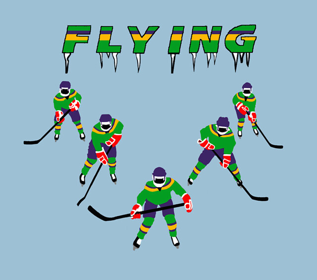
As front-end designers, we are using patterns over and over again – we are employing specific techniques to answer specific needs. But what we lack is a term, a name tag for those methods.
It’s simply like the Flying V of The Mighty Ducks!
After building the Content Structure (HTML) of your website, the next step in the process is building its Visuals (CSS).
To be able to ease the process of writing the style sheets, we must segment it into levels:
Level 1: Default (browser level)
Level 2: Normalize (boilerplate level)
Level 3: Modify (visibility and sizes level)
Level 4: Template (functionality level)
Level 5: Theme (custom level)
Ideally, each level must be buildt on top of the previous one yet still independent. For example, leaving the style sheet at browser level must present usable information. The same principle applies as one builds the style sheet level per level.
Level 3: Modify
Related Activities
hide accessible names
hide components
set default state of components thru class names
active element padding
spacings (margins between components and paddings around components)
dimensions are set at 100% for Mobile-First
Level 4: Template
Related Activities
set the functionality of utilities such as Search and Navigation
Level 4: Theme
Related Activities
colors
background colors/images
icons
visual elements (badges, logos, lines/borders, shadows, corner radius)
I’m currently working on HopScotch 3 and it involves a lot of revising the HTML markup of content structure plus a lot of structural class names.
In relation to this HTML refactoring, I’d like to share with you some notes on writing the HTML markup of web sites:
Text. Begin by writing in plain text all the important content your web site has. For example, you might have a web site logo – translate it into words; if you web site has a tagline or description, write that too.
Tag. Follow it up by wrapping each text content in its semantic HTML tag. Avoid using div or span just yet. For example, your web site name should be wrapped in a heading tag like h1 since it is the title of your HTML document; your tagline could be wrapped in a p tag. At this point, all heading tags could be in h1 since we have not put these objects in context yet. Eventually, we would be arranging the hierarchy of these tags – from h1 to h6.
Group. This is where div and span will come into play. You will have to group and segment the objects based on semantics and not on visual appearance. For example, you could wrap both the web site name and tagline in one div.
Classify. Put the class names into the grouped structure of the objects. For example, the div that contains the web site name and tagline could be classified as “web-product-name”. The test for its semantics is if the name is true to the objects’ nature – something that isn’t tied up to visual appearance or layout.
Format. To add another level of semantics and structure to the objects, we could use Microformats. It uses a vocabulary of class names that give structure to common content such as a person’s information, a movie’s information, an organization’s information and much more.