Users
- Audience
- Tasks
- Needs
- Information-seeking behavior
- Experience
Content
- Content objectives
- Document and data types
- Volume
- Existing structure
- Governance and ownership
Context
- Business goals
- Funding
- Politics
- Culture
- Technology
- Resources
- Constraints
I still could not wrap my head around the whole idea of frames. However, I did like the structure that was described in relation to linguistics.
We could notice the structure—from the detail towards the bigger picture. Patterns like these are also relevant to Information Architecture.
There could be two approaches in defining elements in a User Interface (UI):
Say, for example, we have a blog post that has a date. In order to define what kind of date it is, we could either define it in a sentence:
or we could define it thru a label:
Please note that in order to create an effective description that communicates its purpose, we have to identify the context in which the element is in. (more…)
To empower designers in working in the Interaction Design stage.

The arrangement of the parts to make sense of the whole.
The language that we use and the meaning that we intend.
Where to look for Nouns?
Parts of a Controlled Vocabulary
In order to begin organizing, use facets:
These are the common taxonomic patterns:
5 Ways to Organize things:
In finding the best term for separating a collection of items, which to use—list or group?
Brain dump:
List implies linearity, structure.
Group implies randomness.
—
In generalizing the semantics of all items in a collection—in an HTML document—go for group.
<ul class="list group">…</ul>

<div class="group">…</div>

<dl class="list group">…</dl>
—
It is important to note that the all HTML elements in the examples could express hierarchy by nesting other elements—but it is in the collection of items that list or group provides semantics.
To recap:
Use list for collection of items that implies order (yes, even for <ul>).
Use group for collection of items that does not imply order.
But I know every rock and tree and creature
Has a life, has a spirit, has a name
Colors of the Wind
In terms of User Interface Design, every element must serve its purpose—its reason for being. In able to be identified, it must have a name and a description of what it does.
The Name—Description—Purpose Information Structure or NDP becomes a tool in identifying any UI element within a system. The Designer would have a glimpse of what it is called (Name), what it does (Description), and why it exists (Purpose). (more…)
As UI designers, it’s easy to jump into sketching UIs through wire frames. Afterall, UIs are commonly visual. But taking a careful step of planning before sketching is a rewarding way of ensuring that the information embedded into the UI is well-thought of.
Just like it making speeches or writing articles, the writer may create an outline. For UI designers, the Outline may be accomplished by these simple steps:
Each step, in general, is a task of prioritization – which is appears first? Which comes first? Which is not important enough to be the last?
After having a list bearing the interaction of content and components, it will now be easier to sketch its corresponding user interface or the Wire Frame.

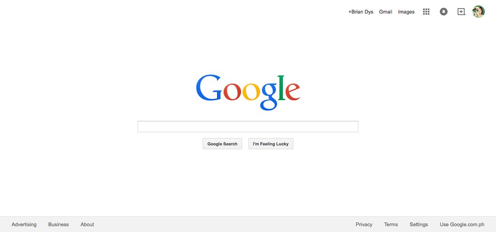
In this post, we will discuss Elements of Information Structure. We’ll use google.com as an example to demonstrate how information is structured in such a way that all its elements are identifiable in singles and in groups.
Contents of web sites and apps can be called “information” – these are words, phrases, symbols, and any representations of elements that give meaning to the user. All information, to be effective, must be properly structured. Imagine a web site that does not show easily the information the user needs – that web site might need to restructure its information by prioritizing the more important ones or what the users usually need.
An object is a singular element.

Note: Some Objects are generalized like in the Navigation Items above. There are several components there (e.g., Apps, Notifications, Social, and Admin) which are listed generally as “Navigation Items”. Ideally, another illustration could show these interactions but for this post, we won’t go into that level.
A component is a combination of more than one object.
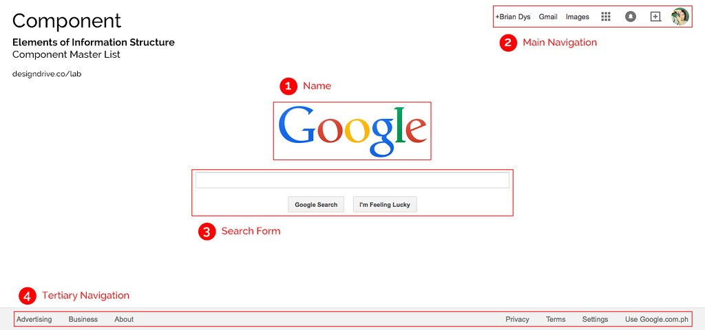
Note: Name is considered a Component due to its HTML markup grouping wherein the Name Component could also contain taglines and other objects related to the name of the web site.
A container is a UI element that contains objects and components. Examples of containers are pages or screens, dialog boxes, pop-overs, and panels to say the least. Container is very useful during interaction because it defines the confinements of the information that will be shown or hidden from the user’s view.

A constructor is a default section in a web site or app. Generally, these three constructors apply to all web products: Masthead, Content, and Colophon. The Masthead contains the name of the web product, the main navigation and search functionality; the Content, well, contains the main content; the Colophon contains additional information of the web product.

Updated
One example of a sub-constructor is a sidebar which attaches to any of the three constructors. Sidebars are denoted by the HTML tag <aside>. It contains and supplementary information, widgets, and plug-ins.
A view is an instance of the web site or app. Usually this is also the name of the current page or screen container the user is in. It basically answers, “What page or screen is the user currently viewing?”
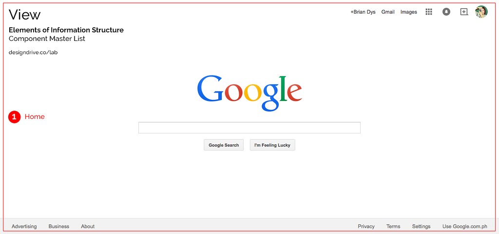
Each red label in the illustrations above can be used as official names of the objects and components. Team members working on the same project will now have a standard name for components and this could lessen the confusion when referring to the said components.