Category: UX Design

  • Deconstructing Instagram

    As an exercise on Front-End Development, The UI Team took a screenshot from instagram.com and treated it as if it were a design mockup.

    We then proceed to deconstruct its Structure and Skeleton (Elements of UX) thru Information Architecture, Interaction Design, Information Design. The knowledge that arose in this deconstruction was used in building the HTML and CSS.

    See the Pen RE:Creation: Instagram by Brian Dys Sahagun (@briandys) on CodePen.

    We, as Visual Designers, have experienced how time-consuming it was to build the Front-End of a design mockup basing only on a simple image.

    The Design Handoff warrants to have more than the Brand Guidelines, Style Guide. It must also have some form of Information Architecture and Interaction Diagram that could greatly make Front-End Development faster.

  • Voyager DX & IdeaSpace – 1st Meetup

    I had the privilege of sharing about Organic Growth and UX with the IdeaSpace 2017 startups. This was a meetup event by Voyager DX (digital transformation).

    Presentation Notes

    Introduction

    First of all, congratulations to all of you, IdeaSpace startups in being part of this very helpful and enabling organization.

    I am also thankful to be part of IdeaSpace 2016 as the designer for Aboo (an audiobook platform).

    Let me introduce myself.

    • You may call me Dys
    • Here in Voyager, we have products both for the consumers and for the enterprise, for startups like yourselves
    • I and my team lead the user interface design of products in the digital customer engagement department
    • I started out my career focusing on the creative aspect of design
    • Designing for digital products that serves Voyager’s clients and our clients’ customers enabled me to widen my focus to include the user experience aspect of design

    Let me share with you some insights on how you could leverage on UX improvements to foster organic growth within your startups.

    I would be mentioning the words “users”, “audience”, and “customers” quite often. Please note that I might use them interchangeably while simply pertaining to the group of people that you serve or wish to serve.

    What is User Experience?

    • User Experience or UX as a design principle simply means putting your users at the forefront of your business
    • In the decisions you make in your business, you always consider helping them achieve their goals in using your products and services
    • Your users are also your customers. They are the lifeblood of the business.
    • Needless to say, improving user experience also improves the business.

    What is organic growth?

    What is organic growth?

    • Organic growth is focusing on your current strengths and making it stronger
    • Organic growth is leveraging on your current success
    • What you are now, what you have now, you work on it and make it better

    What is organic growth?

    • If currently you only have 3 Facebook followers, there’s nothing else to do but to grow it to your desired number
    • Of course, for it to be organic in the most organic sense, the growth must come from the satisfaction and happiness of your customers

    Now that we’ve defined UX and Organic Growth, the question is:

    Could you drive organic growth thru UX improvements?

    Yes, of course.

    Let me share with you these 4 simple practices of UX improvements.

    4 Simple Practices of UX improvements

    1. Cohesive look & feel

    Question: who among you have Facebook pages or communities for your startups?

    How about Twitter?

    Instagram?

    How about websites?

    It is common for businesses to be where most of the people are.

    You are present in those different channels and platforms.

    It is important to have a cohesive, unified look & feel in all of those channels and platforms.

    1. Cohesive look & feel

    The look & feel is the aspect of your brand that appeals to the senses.

    It includes but not limited to your

    • Logo and banner
    • the colors, typography, and layout that you use in your designs
    • the tone of voice that you use in communicating with your audience

    Things that your brand exudes and your audience perceive is the look & feel.

    How do you look or appear in their perception?

    How do you make them feel?

    Be cohesive.

    It will strengthen your sense of identity with your audience.

    2. Clear Call-to-Action

    It’s a given. We are present and active in multiple channels and platforms.

    We constantly exert effort in maintaining a role in our customers’ lives – some, more active than others.

    The messages that we send out to our audience could be more effective if there’s a clear call-to-action.

    This is true especially for messages with marketing intent.

    2. Clear Call-to-Action

    • A clear CTA directs your customers to the most important thing that either you want them to do or they want to do
    • In a way, it is a means to help your customers get from point A to point B in the fastest and easiest way possible

    2. Clear Call-to-Action

    Let’s take a look at an example of what a clear call-to-action looks like.

    This is WeAreVamos.com.

    Vamos is a local boutique brand that started 4 years ago with a 4-model line-up of socks and now has a wider product range and is retailing in 100 shops in 4 countries.

    There are only two things to do in this website.

    1. Shop Now (the CTA)
    2. or shop later

    The call-to-action hits the nail on the head by being both

    • the action the business wants its customers to do and
    • the shop is probably what most customers are looking for when they went to the site

    Because of the clear CTA, the customers could immediately begin accomplishing what they intend to do

    2. Clear Call-to-Action

    Having a clear CTA is just the start.

    It’s important to note that what lies beyond the CTA must be what your customers expect to see.

    In this case, the e-commerce shop.

    A big part of Vamos’ success lies in leveraging Tackthis as its e-commerce platform.

    Tackthis streamlines the operational processes so that the business owners of Vamos could focus more on product development.

    3. Consistent Branding

    • Branding is more than the look & feel
    • Branding goes to an extent that it personifies your relationship with your customers
    • And being consistent in your actions and responses is a sure way to develop this relationship into a stronger one

    3. Consistent Branding

    Where should you be consistent?

    If you’re present in different channels like websites and search engine assets:

    • Be consistent in bringing and showing up-to-date information
    • Users love not getting frustrated
    • So that contact number should have an answer waiting on the other line

    In social media:

    • Be consistent in being active in your engagements with your audience like reacting to their posts
    • When you post a message, follow-up on the inquiries in the comments section

    And in general:

    • Be consistent in being responsive to questions, comments, and even complaints of your customers
    • Let your customers feel that they are being heard

    A consistently active and responsive brand exudes trustworthiness.

    Your customers know they can count on you.

    4. Own Audience

    Cohesive look & feel, clear call-to-action, consistent branding…

    These could all make your users happy but

    Remember to also build an audience on your own turf.

    • Social networks are like rented spaces
    • Facebook and Instagram could change their rules and worse, they could, one day, close down their businesses
    • Then you might lose control of everything that you’ve built on top of these platforms

    4. Own Audience

    • In this regard it is important that you have also grown your audience within a platform that you own, within a platform whose control is solely yours
    • This will ensure that your engagement with them will not be interrupted by uncontrollable factors
    • Investing in your own platform may simply mean
      • having your own website or
      • having your own e-commerce shop
      • these are indispensable strategies in the digital age
    • Serving your own information and content and
    • Having your audience subscribe to email updates are some of the ways to grow your audience in your own platform
    • All these, of course, with the support of social networks

    4. Owned Audience

    Being in your own platform is just the start.

    Reaching and keeping your intended audience comes next.

    This is Philippine Airline’s own platform – a mobile app.

    The time came when they needed to grow their mobile app users.

    So they partnered with us thru our customer engagement platform, Freenet.

    Freenet enables your websites and apps to become more accessible to your intended audience thru its Sponsored Data technology.

    Partnering with Freenet has helped PAL increase their mobile app visits from 660,000 to almost 2 million in just 6 months – a 190% growth. This translates to a 140% increase in their mobile app usage.

    Let’s have a recap.

    Having these 4 simple practices of UX improvements (a.k.a. making customers happy) are sure-fire ways to foster organic growth in your company – especially if you’re a rising star in the startup industry.

    Thank you for your time.

    More power to your startups.
  • What is the difference between good and bad UI design?

    The difference is in the taste.

    Good UI tastes good while bad UI tastes bad.

    But some people like the taste of bad and some people like the taste of good.

    It makes no difference if you could serve what people like.


    Update: 20 May 2022

    Looking back at my answer from almost 4 years ago, I would now expound that bad UI design causes bad things to happen like users not being able to achieve their goals; users making grave mistakes; users getting addicted the wrong and unhealthy way. All these (and more) are examples of what bad design offers.


    Originally published in Quora

  • Different Component States

    In designing the user interface (UI) of an app, it is common to start with the design of the populated state of the UI. As designers, we envision perfect scenarios, common flows, and predictable results. This, understandably, contains the bulk of work a designer has to face. It contains all sorts of issues that need to be addressed.

    In turn, we might neglect designing for the different states of the component or the whole system that we are designing.

    In general, here are the different states a component might be in:

    • Populated
    • Blank

    Populated

    The populated state simply means that the component has been modified to have its intended content. In the example of an Accounts page, there is at least one account created.

    See the Pen Component State: Populated by Brian Dys Sahagun (@briandys) on CodePen.

    Blank

    The blank state occurs when there is no content – whether it is the initial appearance or a result of removing all previous content.

    See the Pen Component State: Blank by Brian Dys Sahagun (@briandys) on CodePen.

    Always consider the design of the other states of the components.

  • Revisiting CSS Levels

    I am currently making a curriculum for the basics of HTML and CSS.

    Revisiting CSS Levels, I have written in the past about it:

    The important thing to remember is to pattern it after the Levels of HTML wherein we must begin with Accessibility and Usability in mind.

    And from there on, we build towards Visual Design.

    Using this as basis, one could argue that Colors and Typography are “nice-to-haves”.

    Can your design stand in black and white?

    Can your design stand in a serif font?

    Yes, it should.

  • Putting “Skip to Content” Into Context

    Does the HTML markup of your website has an accessibility function in the form of “Skip to Content”? If yes, then you would notice that it is located at the topmost of the markup. This is as such in order to make it the first focus when using keyboard to navigate.

    Now you may ask, “Shouldn’t the document title be at the topmost of the document?”

    Not when you put this accessibility function into the context of its intended use. The user, upon arriving at your website might have come from a link or have typed a URL into the web browser. That could’ve served the purpose of document title that ensures the user where they are going to or arriving at.

    The second part of this context is the user being able to go directly to the content — skipping every element that isn’t part of their purpose for visiting the website.

  • The Outline: That Thing Before the Wire Frame

    As UI designers, it’s easy to jump into sketching UIs through wire frames. Afterall, UIs are commonly visual. But taking a careful step of planning before sketching is a rewarding way of ensuring that the information embedded into the UI is well-thought of.

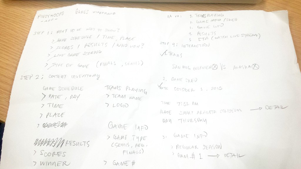
    The Outline
    An example of the Outline used in PinoyHoops App

    Just like it making speeches or writing articles, the writer may create an outline. For UI designers, the Outline may be accomplished by these simple steps:

    • Step 1: What do you want to show the users
      Or what do the users want to see? Based on personas, list down the things that will help them achieve their goals or accomplish tasks.
    • Step 2: Content / component inventory
      Using the list in Step 1, break down each piece of content that will be put into the UI. You may also start with bigger groups thru components.
    • Step 3: Information architecture
      Now, rank the content and components based on the user’s task flows and based on importance
    • Step 4: Interaction
      Plot down connections between content and components. Ask yourself “what will happen if the user interacts with a component?”

    Each step, in general, is a task of prioritization – which is appears first? Which comes first? Which is not important enough to be the last?

    After having a list bearing the interaction of content and components, it will now be easier to sketch its corresponding user interface or the Wire Frame.

  • 3 Layers of an Active Element

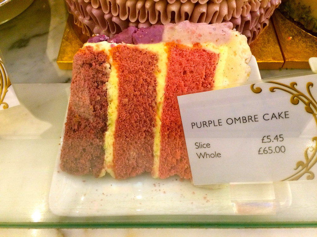
    Imagine this ombre cake:

    Ombre Cake
    Photo by sackerman519 on Flickr.

    It looks yummy and it has layers.

    It is similar with active elements – they must have three levels for the purpose of CSS.

    The first level is the textual element itself. The second level holds the function of the active element (e.g., <a> or <button>). The third level is for positioning. Initially, it appears that the default way to put it is this way:

    [html]
    <a>Label</a>
    [/html]

    And since this is for the purpose of CSS, we must implement Framing for the textual element and for positioning. These frames will act as hooks for CSS. Look at this example:

    [html]

    <div> <!– Frame for positioning –>
    <a>
    <span> <!– Frame for textual element –>
    Label
    </span>
    </a>
    </div>

    [/html]

    Here’s a demo to show a floated button:

    Oh and by the way, here’s an ombre potato:

    Ombre Potato
    Source: Ombre Potato and Cheese Torte on Green Gourmet Giraffe
  • Building a Technical Vocabulary

    As front-end designers, we are using patterns over and over again – we are employing specific techniques to answer specific needs. But what we lack is a term, a name tag for those methods.

    It’s simply like the Flying V of The Mighty Ducks!

    Flying V - Shirt Print Design by MrTWilson
    A t-shirt print design by MrTWilson at Redbubble.

    So far, I’ve added Padding and Framing to my vocabulary.

    Let’s try another one. Say for example, I need the following for my website’s header:

    • Fixed-height header
    • Responsive width
    • The content of the header are all vertically-aligned in the middle
    • If the content of the header exceeds the fixed height, then it will respond

    What kind of solution does this need and what can we name the technique?