In designing the user interface (UI) of an app, it is common to start with the design of the populated state of the UI. As designers, we envision perfect scenarios, common flows, and predictable results. This, understandably, contains the bulk of work a designer has to face. It contains all sorts of issues that need to be addressed.
In turn, we might neglect designing for the different states of the component or the whole system that we are designing.
In general, here are the different states a component might be in:
Populated
Blank
Populated
The populated state simply means that the component has been modified to have its intended content. In the example of an Accounts page, there is at least one account created.
As UI designers, it’s easy to jump into sketching UIs through wire frames. Afterall, UIs are commonly visual. But taking a careful step of planning before sketching is a rewarding way of ensuring that the information embedded into the UI is well-thought of.
Just like it making speeches or writing articles, the writer may create an outline. For UI designers, the Outline may be accomplished by these simple steps:
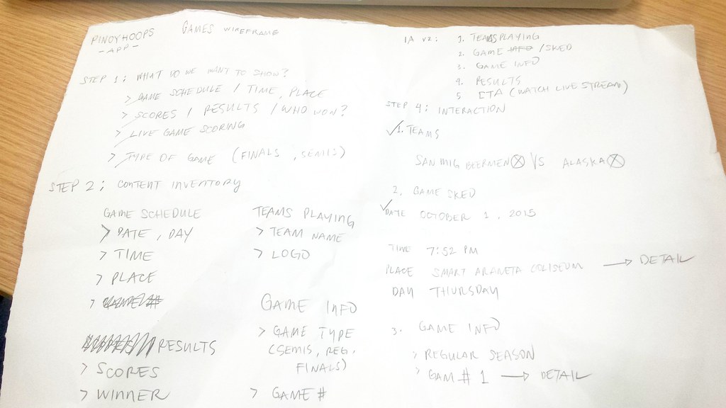
Step 1: What do you want to show the users Or what do the users want to see? Based on personas, list down the things that will help them achieve their goals or accomplish tasks.
Step 2: Content / component inventory Using the list in Step 1, break down each piece of content that will be put into the UI. You may also start with bigger groups thru components.
Step 3: Information architecture Now, rank the content and components based on the user’s task flows and based on importance
Step 4: Interaction Plot down connections between content and components. Ask yourself “what will happen if the user interacts with a component?”
Each step, in general, is a task of prioritization – which is appears first? Which comes first? Which is not important enough to be the last?
After having a list bearing the interaction of content and components, it will now be easier to sketch its corresponding user interface or the Wire Frame.
As front-end designers, we are using patterns over and over again – we are employing specific techniques to answer specific needs. But what we lack is a term, a name tag for those methods.
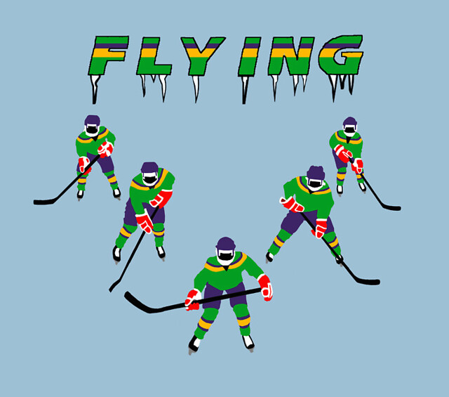
It’s simply like the Flying V of The Mighty Ducks!
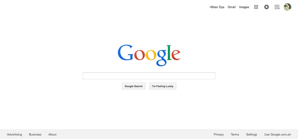
In this post, we will discuss Elements of Information Structure. We’ll use google.com as an example to demonstrate how information is structured in such a way that all its elements are identifiable in singles and in groups.
A screenshot of google.com’s home page.
Elements of Information Structure
Contents of web sites and apps can be called “information” – these are words, phrases, symbols, and any representations of elements that give meaning to the user. All information, to be effective, must be properly structured. Imagine a web site that does not show easily the information the user needs – that web site might need to restructure its information by prioritizing the more important ones or what the users usually need.
Object
An object is a singular element.
Illustration 1. Objects are highlighted on google.com screenshot.
Note: Some Objects are generalized like in the Navigation Items above. There are several components there (e.g., Apps, Notifications, Social, and Admin) which are listed generally as “Navigation Items”. Ideally, another illustration could show these interactions but for this post, we won’t go into that level.
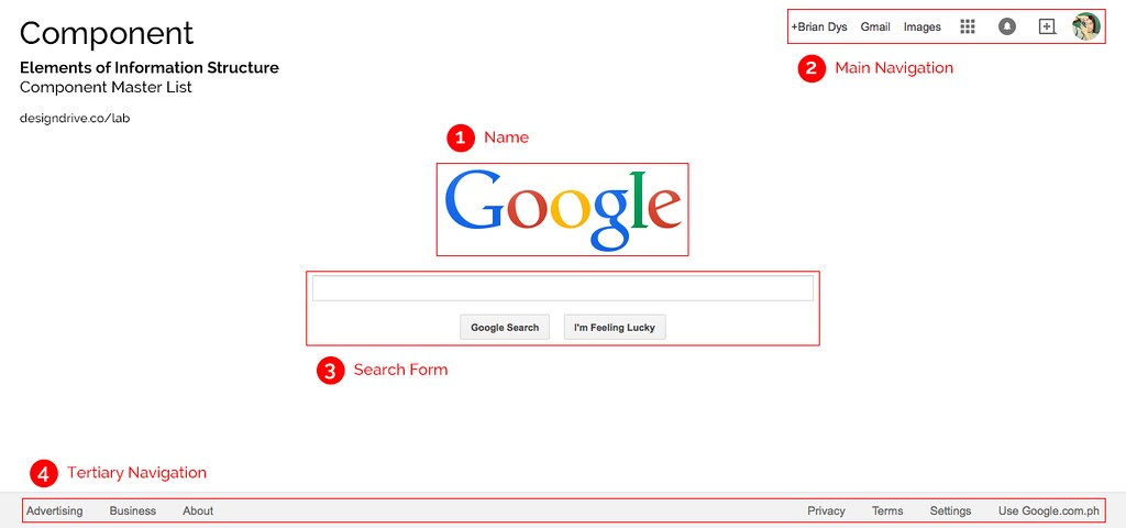
Component
A component is a combination of more than one object.
Illustration 2. Components are highlighted on google.com screenshot.
Note: Name is considered a Component due to its HTML markup grouping wherein the Name Component could also contain taglines and other objects related to the name of the web site.
Container
A container is a UI element that contains objects and components. Examples of containers are pages or screens, dialog boxes, pop-overs, and panels to say the least. Container is very useful during interaction because it defines the confinements of the information that will be shown or hidden from the user’s view.
Illustration 3. Container type is page.
Constructor
A constructor is a default section in a web site or app. Generally, these three constructors apply to all web products: Masthead, Content, and Colophon. The Masthead contains the name of the web product, the main navigation and search functionality; the Content, well, contains the main content; the Colophon contains additional information of the web product.
Illustration 4. Constructors are highlighted on google.com screenshot.
Sub-Constructor
Updated One example of a sub-constructor is a sidebar which attaches to any of the three constructors. Sidebars are denoted by the HTML tag <aside>. It contains and supplementary information, widgets, and plug-ins.
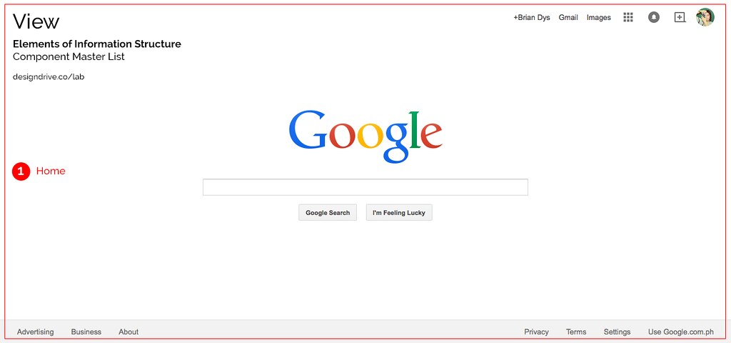
View
A view is an instance of the web site or app. Usually this is also the name of the current page or screen container the user is in. It basically answers, “What page or screen is the user currently viewing?”
Illustration 5. View is highlighted on google.com screenshot.
Conclusion
Each red label in the illustrations above can be used as official names of the objects and components. Team members working on the same project will now have a standard name for components and this could lessen the confusion when referring to the said components.