I have often seen UX designers present bewildered development teams with an uncoordinated stream of design deliverables that define what they need to build—for example, Adobe Photoshop or XD screen designs, Figma prototypes, Confluence documents, and Excel spreadsheets, along with some hand-coded HTML and JavaScript. Plus, UX teams often seem oblivious or uncaring about the problems their use of multiple, disparate tools causes development teams. Indeed, development teams themselves are sometimes unaware that their job could be so much easier if UX teams used fewer tools and used their tools in a more coordinated manner.
Sometimes, when I consider what tremendous consequences come from little things—a chance word, a tap on the shoulder, or a penny dropped on a newsstand—I am tempted to think there are no little things.
It starts with this: put your desk in the corner, and every time you sit down there to write, remind yourself why it isn’t in the middle of the room. Life isn’t a support-system for art. It’s the other way around.
Organizations need guideposts. They need an outline; employees need to know each day when they wake up why they’re going to work. This outline should be short and sweet, and all encompassing: Why do you exist? What motivates you? I call this a mantra — a three or four-word description of why you exist.
One thing’s for sure about the Cancel action in a form: it is a negative within the context of Proceed as the positive.
Then again, in the context of what the user’s goal is, the positive and negative may be one or the other.
For example, in a 5-step interaction to fully complete the user’s profile, of course, as the designer, the positive action for you is the Proceed until the 5 steps are completed.
However, this depends on the user. Say user reached step 5 and a personal information is being asked and it’s not agreeable, then what could be a positive interaction for him/her?
A Cancel or a Skip & Save?
To keep it simple, design with the user’s best interest in mind.
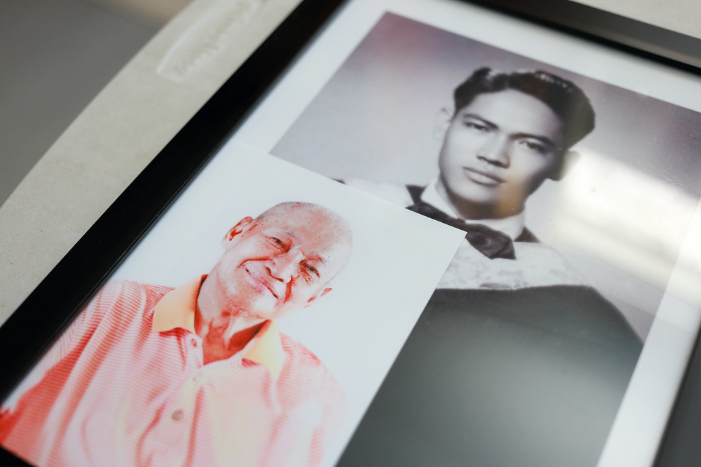
Two photographs of my grandfather, Adriano Ricasata — young and old.
My grandfather, Adriano Ricasata, an electronics and communications engineer, an inventor, a pioneer of radio installations in public utility vehicles in Cavite City, a father, a kind soul, has returned to our maker on the 29th of January 2016.
His wake is at St. Peter Chapel, Kawit, Cavite (near LTO going to Centennial Road).
Piso o bente
I have rich memories of Daddy since childhood. In grade school, my cousins and I would take turns with him swinging us into the air. In his electronics classes we would barge in to ask for recess money right in front of his whole class; he would reach into his pocket to give us coins of up to ten pesos. In his electronics shop, we would find him amidst appliances under repair. Jars of nuts and bolts lined the shelves. Only him on a high chair was lit by a bright lamp soldering and rewinding stuff we didn’t mind because we’d just ask for recess money. We’d demand twenty pesos if a cousin who went in first would brag about the orange bill upon coming out.
Countless of childhood Christmases we spent at A.R. (the school he and grandmother established, also named after him). His old white Mercedes-Benz would be packed with almost 15 kids going to Ligtong (the town where he grew up) to continue the celebration.
The stories of his childhood days, he would retell us tirelessly — his adventures in the rice fields with his carabao; his sacrifices in going to school; his encounter with a ghostly Uncle Sam in stilts by the curve of the road near Lido Beach.
He always had this happy disposition in him. His modest living, despite being in a big property, always intrigued me yet I never questioned why he lived in a small room while my grandmother lived in a room big enough to be a small house.
Ar-Fel Apartment
In 2006, I had the opportunity to live in one of the apartment units they invested in back in the 60s. I remember asking him for a discount on the rent during Christmas of the same year. In turn, I somehow looked after their rental business. We’ve had our disagreement when I refused to pay part of my rent due to a change in management. That’s the first time I heard him curse out of frustration. There at dining table in his unit he poured bits and pieces of his misgivings and shortcomings with his family. A moment which I just had to fill in the blanks to understand deeper the melodrama that constantly ran in our family. He apologized for his outburst — he always did whenever he thought he’s making someone feel uncomfortable.
About 3 years ago, the opportunity to manage the apartment fell into my lap. My main motivation in accepting it was to strengthen his source of income as he was already getting older and weaker. He had retired from being Mr. Fix it all, at last.
Upon reaching the vicinity of The Medical City, I found out that the small zippered compartment of my backpack was open. Probably because I walked and crossed Ortigas Ave. using the footbridge.
The footbridge is notorious for pickpockets—hooligans who would position themselves behind unknowing pedestrians wearing backpacks. In a flick of a finger with the featherlike touch, they could unzip bags and take wallets or mobile phones. Or your lunch if it looks very scrumptious.
The traffic view from The Medical City footbridge in Ortigas Ave.(more…)
A target area in a website or app is an area that enables a user to interact with the interface through touch or a pointing device such as a mouse.
Examples are links, buttons, form elements, etc.
According to Fitts’s law, “the time required to rapidly move to a target area is a function of the ratio between the distance to the target and the width of the target”.
For a target area to be easily tapped or clicked by the user, its area must be adequate enough to be interacted upon.
Visually, it may appear small (such as an icon), however, it could still have an adequate target area.
These are the settings I use (as of December 2019) when making a photo slideshow video—the pictures and music pretty much carry the feel-goodness of the whole presentation.
I like the Ken Burns effect of alternate zooming in and out of picture from one to the next. Give each picture some 4 seconds and when a 2-second transition is added, it will be less at around 2 seconds—just enough to let the audience fixate on a single picture.
Here is the latest video that I made for Jaycelle.