Category: Updates

  • Metro Manila Roadway Tablet – Launched

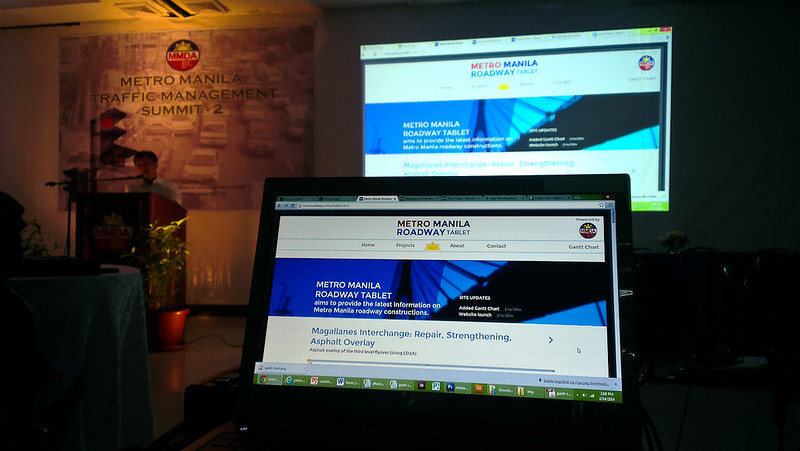
    After weeks of design planning and working late nights, Metro Manila Roadway Tablet has launched during the Metro Manila Traffic Management Summit on February 14, 2014.

    MMRoadway.com Launch
    Chairman Francis Tolentino launching the website in front of summit participants.

    Our website’s purpose is to inform the general public (especially those living in Metro Manila) of each project’s status and important information.

    Metro Manila Roadway Tablet
    A screenshot of Metro Manila Roadway Tablet’s homepage.

    (more…)

  • Week-links 1: Feb 17 – 21, 2014

    1. Trello

      https://trello.com/

      Trello is the fastest, easiest way to organize anything, from your day-to-day work, to a favorite side project, to your greatest life plans.

      Trello
      A screenshot of Trello homepage.

      I’m trying this out for short-range project management – to-do lists and assignments – Trello answers all that.

    2. Scout

      http://mhs.github.io/scout-app/

      Scout is a cross-platform app that delivers the power of Sass & Compass into the hands of web designers.

      Scout
      A screenshot of Scout homepage.

      Here’s something I’ll also be trying along with Brackets – Scout. It’s an app that will watch for Compass and Sass files in a folder.

    3. Brackets

      http://brackets.io/

      Brackets is an open source code editor for web designers and front-end developers.

      Brackets
      A screenshot of Brackets homepage.

      I’m looking for a replacement for Adobe Dreamweaver for my front-end design work. I’ll be checking out Brackets and Sass.

  • International Red & MMDA

    IR + MMDA + Bon Jovi

    International Red Design Studio has partnered with MMDA to provide you with the latest information on current and upcoming Metro Manila roadway constructions.

    We’re talking about interconnected infrastructures that will be worth the hurly burly traffic jam the constructions will cause.

    So to all passengers out there – whether you’re a commuter or a backseat driver – sit back, relax, and enjoy the ride (to the drivers as well).

    Say goodbye to yesterday
    Hit the gas there ain’t no brakes on this lost highway
    ~ Lost Highway by Bon Jovi


    By the way, Bon Jovi’s Lost Highway is up there with the logos because the album’s accompanying me tonight as I work on the project.

    I’ll keep you posted once the website has launched.

  • Mini-FFC #16 – Thoughts

    1st Topic: Dealing with Clients

    Speaker: Rina Malonzo

    • Listen to client needs – identify the real problem
    • Charge with eyes open – learn the product life cycle and the work involved
    • Set expections – be realistic, under promise and over deliver
    • Build trust – tell the truth, don’t disappear, failure isn’t an option
    • Tell clients if they are “wrong” – listen to why they don’t like a design, design for the customer, have an intelligent conversation – don’t simply say “OK”
    • Get a downpayment before starting a project
    • Get repeat business

    Showcasing Your Portfolio

    • Show your future – showcase the projects you want to attract
    • Show your best works in the first 5 items
    • Show at most 20 samples

    2nd Topic: PhoneGap

    Speaker: Chard Gonzales

    PhoneGap is a free and open source framework that allows you to create mobile apps using standardized web APIs for the platforms you care about.

    Source: http://phonegap.com/

    3rd Topic: RCSS

    Speaker: JP De Guzman

    RCSS (‘Recess’ / Narcissistic name – ‘Rain CSS’) is a PHP-based CSS Processor. Popularized by known CSS pre-processors such as LESS and SCSS, RCSS aims to bring the joy and fun back in writing CSS with nifty features straight out-of-the-box. Aside from the core feature built under its hood, it can be extended via plugins that anyone can easily write and share.

    Source: http://www.raincreativelab.com/rcss/

  • 2014 Resolute Resolution #2

    In meetings, only involve persons who can say a thing or two about your agenda.

  • 2014 Resolute Resolution #1

    Keep meetings under 1 hour.

  • The Two Pizza Rule by Jeff Bezos

    If a team couldn’t be fed with two pizzas, it was too big.

    https://buffer.com/resources/small-teams-why-startups-often-win-against-google-and-facebook-the-science-behind-why-smaller-teams-get-more-done
  • Designing thru the display

    In my experience as a designer (both for print and web), I’ve come to differentiate my approach to each medium in terms of spatial measurements.

    For print, all I needed to measure are the margins, in inches–and it’s all “what looks good” from there. For web, everything must be pixel-calculated–the margin, padding, distance from each element, width, height, etc.

    I wouldn’t be able to answer how many inches the image element is away from another element in a, say poster I’m designing–I could only say it’s just about the right distance from the other elements. But when you ask what is the height of the button on that app I’m designing– I could simply say it has a minimum height of 48 pixels (in 160 pixel density) and there’s 24px padding on both sides of its label and 18px padding on the top and bottom; it is right-aligned with a 32px right margin and it is 48px apart from elements before and after it.

    The reason for this is that, unlike print, after designing a website or an app, a designer would go on developing that design (which is only just a concept) into something interactive thru a device’s display where one has to account for the very limited space and optimal positioning and size of the elements. Pretty much the same as after designing a poster, you go on printing it to be tangible.

    Displays for the web are thru the devices’ display monitors while for print, it is the actual medium–like paper. Designing thru the display in mind means that one must come to terms with the unit of measurement–at least for the minimum size of an element–be it the minimum width and height of a touch surface or the minimum points of text on a poster. This means that, for digital, if your device could display a bazillion ppi, you must design for it using its css pixel or as I call it 48/160 – 48px as minimum width and height of interactive elements (based on Android) and at 160 ppi.

    This way you would be able to account for the initial available space of the display using the optimum size of UI elements. Also, the end product would be at that actual size on the display–meaning, your 48px x 48px element is displayed as that (and not 1.5x or 2x zoomed in).
  • Center-align lists

    It’s easy to center-align a bunch of text:

    [code lang=”html” title=”HTML”]
    <p>Lorem ipsum dolor sit amet, consectetuer adipiscing elit.</p>
    [/code]

    [code lang=”css” title=”CSS”]
    p {text-align:center;}
    [/code]

    But how do you center-align a list such as a ul or an ol with children set as inline (or side by side)?

    Simply set the parent (ul) to text-align:center and the children (li) to display:inline-block

    [code lang=”html” title=”HTML”]
    <ul>
    <li><a href="#">Home</a></li>
    <li><a href="#">About</a></li>
    <li><a href="#">Contact</a></li>
    </ul>
    [/code]

    [code lang=”css” title=”CSS”]
    ul {
    list-style:none;
    margin:0;
    padding:0;
    text-align:center;
    }

    li {display:inline-block;}
    [/code]

    This is useful for footer links displayed in mobile browsers wherein you want texts to center-align.

    See a demo at CSSDesk

  • Design principle #1: set defaults

    Avoid making the user choose from too many options.

    Do: set default options for users to choose from–ideally the most common and provide a way for them to choose what is not initially presented.

    Design principle #1: choose a default

    Avoid: presenting a wide array of options that the interface gets cluttered and the users confused on which to choose.

    Design principle #1: choose a default

    Choose the most common/natural path for the users.

    Do: set default actions in the context of the task while still making other actions available.

    Design principle #1: set a default

    Avoid: cramming available actions altogether; provide importance to actions which are more contextual than others.

    Design principle #1: set a default

    Design principles are not rules to abide by but more of guidelines in designing products for users. They should be put in context and tweaked when necessary.