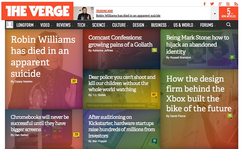
The Verge has some colorful boxes that contain a preview of their articles. Basically, they look like this (RIP Robin Williams):
We’ll recreate one of those boxes using the following:
- HTML & CSS
- A picture of our favorite local band, Eraserheads

Source: Day Cabuhat’s Instagram - Nice colors from colourcode
- ColorZilla’s Ultimate CSS Gradient Generator
Disclaimers
- I didn’t view the HTML or CSS source of The Verge
- I recreated it using the visible information with emphasis on the content structure
- the semantics could be improved by ARIA
- no information on browser compatibility
TL;DR
This is the final result of the recreation.
[codepen_embed height=”395″ theme_id=”1820″ slug_hash=”tJdGn” default_tab=”result”]See the Pen Recreating The Verge’s Article Preview Boxes by Brian Dys Sahagun (@BrianSahagun) on CodePen.[/codepen_embed]
Step 1: Content Structure
Without class attributes and generic elements:
Remember to use the appropriate HTML tag for each content – that’ semantics.
[html]
<article>
<a href="#">
<h1>The Erasherheads Live in London</h1>
<p>by Julie Tearjerky</p>
<p title="22 comments">2comments</p>
</a>
<img src="https://farm4.staticflickr.com/3868/14386991112_e7118cff3b_z.jpg" alt="Eraserheads in London" width="640" height="478" />
</article>
[/html]
We add class attributes and generic elements for the following reasons:
- to make the elements more semantic (HTML tags alone won’t cut it – we must classify/name the elements)
- to make it easy to select elements in CSS (the easier you can pinpoint an element, the better)
[html]
<article class="entry">
<div class="entry-cr">
<a class="entry-link" href="#">
<h1 class="entry-title">The Erasherheads Live in London</h1>
<p class="entry-author">by Julie Tearjerky</p>
<p class="entry-comments" title="22 comments"><span class="comment-count">22</span> <span class="comment-label">comments</span></p>
</a>
<img class="entry-cover-image" src="https://farm4.staticflickr.com/3868/14386991112_e7118cff3b_z.jpg" alt="Eraserheads in London" width="640" height="478" />
</div>
</article>
[/html]
Step 2: Visual Design
Setup the box along with the background image of the band:
[css]
/* The entry box */
.entry-cr {
position: relative;
width: 480px;
height: 320px;
font-family: sans-serif;
/* The background image */
background-image: url( https://farm4.staticflickr.com/3868/14386991112_e7118cff3b_z.jpg );
background-size: cover;
background-position: center center;
overflow: hidden;
}
[/css]
Let a fill-up the whole dimension of the box so that it is link active (clickable):
[css]
/* Making the whole box link active */
.entry-link {
position: relative;
display: block;
padding: 16px;
width: 100%;
height: 100%;
color: #fff;
text-decoration: none;
z-index: 2;
box-sizing: border-box;
}
[/css]
Design and layout the text elements:
[css]
/* The article title */
.entry-title {
margin: auto;
margin-bottom: 16px;
font-family: Georgia;
font-weight: normal;
}
/* The author name */
.entry-author {
float: left;
margin: auto;
padding: 4px 0;
font-size: 14px;
}
/* The comments */
.entry-comments {
float: right;
margin: auto;
}
.comment-count {
display: inline-block;
padding: 4px;
font-size: 14px;
line-height: 1;
color: #222;
background-color: yellow;
vertical-align: middle;
}
.comment-label {
display: none;
}
[/css]
Create the background gradient:
[css]
/* Creating the background cover image via pseudo-element */
.entry-cr:after {
content: ”;
position: absolute;
top: 0;
left; 0;
width: 100%;
height: 100%;
background: #4a762e;
/* The gradient */
background: -moz-linear-gradient(-45deg, #4a762e 0%, #2f7881 50%, #69318d 100%);
background: -webkit-gradient(linear, left top, right bottom, color-stop(0%,#4a762e), color-stop(50%,#2f7881), color-stop(100%,#69318d));
background: -webkit-linear-gradient(-45deg, #4a762e 0%,#2f7881 50%,#69318d 100%);
background: -o-linear-gradient(-45deg, #4a762e 0%,#2f7881 50%,#69318d 100%);
background: -ms-linear-gradient(-45deg, #4a762e 0%,#2f7881 50%,#69318d 100%);
background: linear-gradient(135deg, #4a762e 0%,#2f7881 50%,#69318d 100%);
filter: progid:DXImageTransform.Microsoft.gradient( startColorstr=’#4a762e’, endColorstr=’#69318d’,GradientType=1 );
/* The inner-shadow */
box-shadow: 0 0 32px hsla(0, 0%, 0%, .15) inset;
opacity: .85;
transition: opacity .25s ease;
z-index: 1;
}
.entry-cr:hover:after {
opacity: .75;
}
[/css]
Hide the article cover image in img tag:
display: none is a crude approach for this purpose. there is a “visuallyhidden” approach used by HTML5 Boilerplate which is ideal.
[css]
/* Hiding the cover image <img> */
/* This is for fallback purposes. Without CSS, the image <img> will appear */
.entry-cover-image {
display: none;
}
[/css]
That’s it! Always build the content structure (HTML) first before worrying about the visual design (CSS).
Leave a Reply