In its basic sense, HTML is standalone. It is independent from CSS especially from the perspective of screenreaders and search engine crawlers. This goes to show about the importance of semantics and content structure in the HTML markup.
In this regard, I strongly advocate for the manipulation of the style sheet instead of the manipulation of the HTML markup.
Consider the scenario wherein you, as the front-end designer, have only 3 chances in having control over the HTML markup and on the other hand, an unlimited number of revisions and updates on the visual design aspect of the project.
This indeed is a far-fetched situation – but it definitely will get us creative in setting up the HTML markup or in planning ahead. This scenario encourages us to use semantic names in the class attribute of the HTML markup as opposed to peppering it with presentational class names which are heavily tied up with the style sheet.
In this basic HTML and CSS tutorial, we are going to demonstrate the following:
- the separation of HTML (content structure) and CSS (visual design)
- how to position a secondary element (like a graphic element or a label) thru CSS
position: absoluteandpadding
And some disclaimers:
- while it discusses semantics, it does not tackle accessibility attributes (say, ARIA)
- it does not show any SEO / screenreader test results regarding the benefits of an HTML markup with intentions on content structure or semantic HTML markup
- it only translates into HTML and CSS a specific component (from a much complicated whole), although the HTML and CSS process remains the same if applied to a whole
Separation of HTML and CSS
HTML markup is intended for chunks of text content to have meaning for web browsers (screenreaders and search engine crawlers too, among others that I am not aware of) so that they could very well translate the content into something that people would understand easily.
The text content along with its HTML markup must stand alone without the CSS layer. The content structure must remain intact and must be established before fully considering the visual design. Imagine writing a document in rich text format wherein you could create headings, lists, etc.
This separation prevents the compromise of the content structure. For example, in a visual design mock-up it is shown that the navigation is located on top of the brand logo – in the HTML, should the author be putting the navigation markup first before the brand name markup or vice versa?
In web design, it is not our ultimate goal to only replicate the visual design mock-up using HTML and CSS. While it is important to achieve visual quality, there’s an optimal approach in doing it while adhering to HTML’s semantic intentions. And semantics is the way to properly communicate with search engine crawlers and screenreaders. And of course, ultimately the people to whom the information is served.
The Example
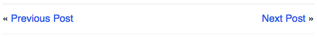
The “Next Post” and “Previous Post” links are common in blog websites. Sometimes they also contain the article titles. Here’s a sample screenshot from PetaPixel.
Step 1: Establish the content structure
Let’s say we want to show the article titles along with their respective labels; the raw content would follow this structure:
Previous Post: Previous article title
Next Post: Next article title
We give importance to the previous article that’s why it’s on top. But if our intention is for the reader to read forward to newer posts, we put the next article on top.
Step 2: Markup using HTML
<label>Previous Post:</label> <a>Previous article title</a>
<label>Next Post:</label> <a>Next article title</a>
Marking up in HTML involves semantics – meaning, assign the HTML element that conveys the meaning of that content. Sometimes it is objective and sometimes it depends on the HTML author’s intention.
In our example, the objective nature of “Previous Post:” is that it is a label and it is also our intention – for it to be a simple text label that’s why we marked it up by the HTML label tag. For the article title, our intention is for it to be a link, so we marked it up by the HTML a tag.
But since the label tag is intended for form elements, we choose another HTML tag that could convey the label meaning. Unfortunately, there isn’t any other HTML element intended for labels outside of forms. Here will come in handy, the generic inline tag which is span. Only use it as a last resort if you can’t match the content with its semantic HTML tag.
<span>Previous Post:</span> <a>Previous article title</a>
<span>Next Post:</span> <a>Next article title</a>
Step 3: Put the proper HTML attributes
<span class="label">Previous Post:</span> <a href="#">Previous article title</a>
<span class="label">Next Post:</span> <a href="#">Next article title</a>
Since span is a generic element, we must put a class attribute with a class name to make it semantic.
Step 4: Label the component
<span class="label">Post Navigation</span>
<span class="label">Previous Post:</span> <a href="#">Previous article title</a>
<span class="label">Next Post:</span> <a href="#">Next article title</a>
Consider these links as one control – a type of navigation that aids the reader to navigate through old and new articles. In this regard, we could label it “Post Navigation”.
Step 5: Check the HTML document in a web browser
Remember about the separation of HTML and CSS? Apart from giving importance to the content structure (the arrangement of content according to its importance from top to bottom), we should also give importance to the bare HTML document that is displayed in the web browser.
Does the content displayed conveys the content structure? Does it show hierarchy of information? Or the very least, is it readable? One could argue that it is readable – although we could further improve its readability by further improving its sematics.
Step 5: Level up the semantics
We will be adding several HTML tags not to “fix” the layout of what the browser displays but to be more semantic which in turn, positively affects the way the content is displayed and laid out in the web browser.
<div class="post-navigation">
    <span class="label">Post Navigation</span>
    <ul>
        <li><span class="label">Previous Post:</span> <a href="#">Previous article title</a></li>
        <li><span class="label">Next Post:</span> <a href="#">Next article title</a></li>
    </ul>
</div>
Here comes the importance of knowing if an HTML element is block-level element or an inline-level element. To simply put, block-level elements simply block off the entire width of the space it occupies while inline-level elements could be joined together on a line – just like in our example on Step 5.
So, basically, span is an inline-level element, as well as a that’s why they are displayed all on one line.
On using <div>
Use div to contain components or content when there’s no appropriate HTML elements that match. Another thing is div provide for the flexibility to nest or contain any kind of HTML element unlike p, HTML standards does not allow it to contain a div, for example.
On using <p>
Personally, I would use p or the paragraph tag as a substitute for div as a block-level element. This is OK for simple text content.
On using <ul>
ul stands for unordered list. I intend to treat the previous and next content to be a list of actions. Though one could also simply intend to treat them as they are, like:
<div class="post-navigation">
    <p class="label title">Post Navigation</p>
    <p class="previous-action"><span class="label">Previous Post:</span> <a href="#">Previous article title</a></p>
    <p class="next-action"><span class="label">Next Post:</span> <a href="#">Next article title</a></p>
</div>
But I prefer using ul as it conveys structure.
Step 6: Check the HTML document in a web browser
That’s more readable, right? While its underlying markup wasn’t constructed to convey layout but meaning.
Step 7: Pre-CSS – classify HTML elements
Now that we got it going for us in terms of readability, we can now proceed to setting-up our HTML markup for CSS considerations.
While the HTML markup of the example above is OK on its own, we must remember that working with CSS requires us to easily pinpoint or target HTML elements directly or at least using fewer selectors, otherwise it would be very difficult to style such elements. We could achieve this by naming HTML elements thru the class attribute. And these attribute values we will use as selectors to pinpoint the HTML element.
<div class="post-navigation">
    <p class="label title">Post Navigation:</p>
    <ul class="action-list">
        <li class="previous-action"><span class="label">Previous Post:</span> <a href="#">Previous article title</a></li>
        <li class="next-action"><span class="label">Next Post:</span> <a href="#">Next article title</a></li>
    </ul>
</div>
Here, we specifically classified “previous-action” and “next-action” so that we could easily pinpoint it during the CSS phase. Of course, apart from CSS considerations, this approach is an added semantics to our HTML document because apart from marking up the content as a list, we specified what type of content are contained within each list item.
At this point, I wouldn’t say that classifying each HTML element is purely for semantic purposes only because we are already transitioning towards the CSS phase, thus pre-CSS.
Watch our for the second and last part of this tutorial tomorrow wherein we will demonstrate that CSS could simply transform the content displayed top to be laid out at the bottom (or anywhere else).