Ever use Spotify? It’s been around for many years now but just two months ago it landed here in Philippines – making everyone curb their Aegis.
Circular images everywhere
No doubt that the traditional rectangle image has lost its edge literally. CSS border-radius enabled designers to carve the sharp edges into rounded corners. And take it to the extreme, the corners vanish and the shape becomes a circle.
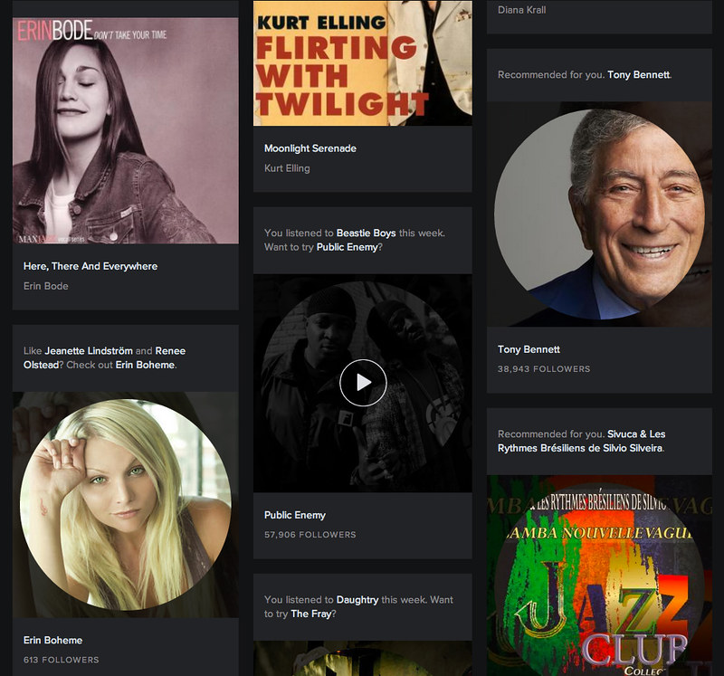
Spotify’s app presents album and artist covers in a circular manner with the same picture faded in the background.
This is what we’ll recreate using HTML and CSS.
What we need
-
The purpose
Our purpose in this study is to show that content structure comes first than visual design.First of all, I am suggesting that most images are representations of something more substantial – like words. They are figures that help the readers visualize the subject of the text. Think of the Bible – it simply stands alone with all those text and it’s a bonus to have illustrations (images as helpers to texts will be another topic).Dammit. I just want you to show me HTML and CSS.
- Should the image be portrayed independently from the title? Meaning, do we have to translate/describe the image thru a caption?
If yes, we’ll use the
imgelement - Do we simply need it for visual design purposes – in other words – without images, could we still convey the important information about the title and its functionality to link to a page?
If yes, then we’ll use any existing element that the content structure will provide.
Let’s choose the latter.
- Should the image be portrayed independently from the title? Meaning, do we have to translate/describe the image thru a caption?
-
The image
In our study, we’ll use our favorite 90s pop band, Eraserheads (it’s OK even if Buddy’s uninterested). What we need is the most recent representation of the band’s togetherness.

The tools
HTML and CSS are our main tools to replicate Spotify’s Album cover style. Here is the complete concoction:
To explain each detail of the approach:
We “named” it class="item-link" to describe the component’s nature – it is an item link however you would look at it.
We added the class artist-item-link to be more specific about the class of that component. This would be useful by having a hook on all items which are artists (and albums for that matter).
As for id="artist-eraserheads", we need this to serve a specific thing only for the Eraserheads item – an image cover for this matter.
span class="label" enables the component to be flexible enough. It separates the linking mechanism from the text label. This makes the two independent from each other when it comes to styling.
We attach a before pseudo-element to item-link to contain the background-image that is transparent (which makes the background-color underneath blend in).
Then we attach an after pseudo-element to contain the foreground image. It becomes circular by applying border-radius: 50%.
Since the foreground image’s size is smaller than the container (set at 90%), we need to position it at the center by using the technique of absolute positioning the element at 50% top and 50% left and offsetting it with negative margins half the size of the dimensions.
.item-link .label {
    position: absolute;
    top: 50%;
    left: 50%;
    margin-top: -45%; /* To offset, must be negative and half of the height */
    margin-left: -45%; /* Must be half of the width */
    width: 90%;
    height: 90%;
}
Lastly, we attach the actual background-image using the id of the artist.
Browser Compatibility
Notes
- You may use an image smaller than the container dimensions – say a 180 x 180px image;
background-size: coverwould ensure that the whole container gets covered by the image but it will be pixellated since the image will be stretched to fill-in. - Using a too large image would be wasteful of bandwidth and is not optimized for mobile device usage; use just the right size based on the container size, image quality and file size.
- Lastly, we demonstrated we can achieve a relatively complex visual design by simply using only what needs to be there – in this case, the link and the label. We did not put any additional
divwhich we, otherwise, would if we based the HTML markup on visual design (instead of treating them independently).
Leave a Reply