I received a confirmation that HopScotch got approved in WordPress Themes Directory.
Author: Brian Dys
-
Categorizing Topics of Web Concepts

There are several blog entries in Design DriveThru about the practical application of HTML and CSS, simple ideas as well. In order to put these entries in a clearer light, there needs to be specific categories where they fall under. This will put things in context so that the reader would know to which extent the entry applies to him or her.
For example, as we talk about Notes on SASS File Structure, how does one try to absorb this concept? You might ask if this entry is important for you as a web or front-end designer. The answer can be made easier by categorizing the topics.
Think and Act
The first categories deal with a particular web concept as being either of the two:
- Theory
- Technique
Theory
Theory deals with general principles.
Theory is a contemplative and rational type of abstract or generalizing thinking, or the results of such thinking. Depending on the context, the results might for example include generalized explanations of how nature works.
Source: Wikipedia
An example of a theory is CSS Principles.
Technique
Technique on the other hand, deals with practical application.
A technique is a procedure to complete a task.
Source: Wikipedia
An example of Technique is Recreating Spotify’s Album Cover.
There could also be an entry with both Theory and Technique as its categories, for example: Using <body> to Define UI States and Types. This entry talks about principles and demonstrates how to apply it.
Brochure and Kiosk
The second part of categories is about the web being generally split into two – it is either:
- web as a document or web as an application
- web as hypertext system (information-oriented) or web as software interface (task-oriented)
The latter is from The Elements of User Experience by Jesse James Garrett.
Webdoc
Web Documents deals mainly with information like Wikipedia or a WordPress blog. This is the primitive beginnings of HTML wherein information are linked to other information via anchor elements.
Webapp
Web Applications deals mainly with services that foster activities and enable the users to accomplish specific tasks. Good examples range from Google Sheets to InVision.
This category set could be mutual like Flickr, for example – it is a webapp yet it deals with images and videos with rich information.
I would be using these categories to contextualize entries mostly discussing HTML because each web object, whether a simple web document or a webapp deals with HTML.
Conclusion
Hopefully this categorization technique will be useful in mapping the context of Front-End Design entries.
-
Smart + Rocket Internet = Voyager > Chikka?
It’s coming together – the ultimate plan of Smart to wipe out the culture of Chikka. Well, it’s not deliberate I guess but that’s the effect of the new business direction that we’re headed. You should well know that recently, PLDT bought 10% of Rocket Internet. If you don’t know Rocket Internet, it’s the parent company of Voyager — just look at the similarity of their names and logos! Exploring the depths off this planet thru a rocket and stuff.
Just kidding. Rocket Internet is the biggest copycat there is on the face of the interwebs. But the good thing about it is that it brings internet products and services to developing markets like our country. If you ever got rescued by Easy Taxi during your morning commute towards a big boss meeting, you have Rocket Internet to thank for that. If you applauded Zalora or Lazada by their prompt delivery of that cat double bed you ordered, applaud Rocket Internet. We in this developing country need not wait for Amazon to cater to us – Rocket Internet’s business model is built this way. They will bring Amazon to our doorstep but in a different packaging under a different name. You may call it fakery, unoriginal, imitation — or class A if you may but what more can you ask for? They are serving us iPhone 6 just weeks after it was released in public. Otherwise, telcos will offer it a day before Apple releases yet a new version.
This is the reality that we’re in now, the business model of Rocket Internet is being adopted by Smart – putting Voyager in the place of Rocket Internet. Voyager will incubate ideas – a new one or an existing one and it will be spun into the hands of an “independent” company. In case you’ve noticed the quotation marks, you might have sensed my sarcasm. The independence of a company isn’t simply rooted to it’s differently-incorporated name. It’s not even in the effectiveness of it looking like it has sprung from bright ideas and hard work without any backing from big shots. It’s effectiveness lies behind its culture – it’s years and years of built-in traditions, values, and principles.
When a parent company suddenly barges in with all these new business directions, they would be like two giant feet trampling over ants mound. People and everything they built will be disturbed — some will run around like headless chickens. It will spell D-I-S-A-S-T-E-R. Sometimes C-H-A-N-G-E spells the same. But let me be clear — change is good especially for a very stagnant and antiquated product development company like Chikka. Development is best for everyone especially in the view of sustainability and progress. But the balance between upholding a company’s culture and introducing development to it is very delicate — tip one side over and you get a very people-centric company and tip the other side over, then walls come crashing down on them. In this situation Smart did it poorly. Two giant feet.
This is all about business but the people are a company’s greatest asset. Or are they?
-
Picture Frames, Time to Go Digital
Picture Print
I took a portrait using my DSLR. It produced an image with a 3:2 aspect ratio.
I went to a photo lab to have it printed.
Do I want it cropped? Hell, no.
I spent hours enhancing and editing it. Besides, I already cropped it to perfection in Photoshop.
No cropping? Then here are the only popular photo paper sizes that I could choose from:
- 3×2 (Wallet size)
- 4×6 (4R)
- 8×12 (8RW)
The other sizes like 3.5×5 (3R), 5×7 (5R), 8×10 (8R) will crop my masterpiece.
So I had it printed on an 8×12 photo paper.
Picture Frame
I went to the picture frames section of my favorite department store.
Only to find out that they are only selling these frame sizes (cue Psycho shower theme):
- 4×6 (4R)
- 5×7 (5R)
- 8×10 (8R)
Now, do I end up snipping the printed photo to fit into an 8R frame?
No. I ended up buying a certificate frame with enough margin to fit my photo.
Cropping Must Stop
This age is digital age; this year is 2014 and it’s ending. Everyone has a digital camera in his or her pocket.
Most likely, the digital picture that one camera produces has either these aspect ratios:
- 4:3
- 3:2
- 16:9
Even a full frame film camera is in 3:2.
So why in the world are photo labs and picture frames still speaking in the language of 5Rs and 8Rs?
The Resolution
Photo papers and picture frames must cater to the popular aspect ratios.
Support 1:1 Instagram size if you must!
-
New Chikka Text Messenger Logo: A Study

The current Chikka Text Messenger logo. Recently, the design team is conceptualizing on a new Chikka Text Messenger branding. As you very well know, the phone and mouse icons aren’t up with the times already. Mobile phones have shed its antenna and keypad; the mouse, well pretty much some still look the same.
What is Chikka Text Messenger?
Chikka Text Messenger or CTM helps Filipinos abroad communicate thru SMS with their families and friends here in Philippines (PH). Basically, if you’re abroad, you text your mom (in PH) thru CTM app using Wi-Fi or data then she receives it as plain SMS. But if she’s also using CTM app and is online, then she receives the text thru the app like instant messenger.
The Balloon Ear
We started the branding redesign by this square icon:

CTM’s square icon designed by Dexter Vivas and Brian Dys Sahagun From here, I simply extracted the message balloon. The resulting icon, also shaped like an ear, embodies communication from end to end – you speak and the recipient listens and vice versa.

CTM Balloon Ear Icon 

-
On Government Information and Finding It
Reading in Facebook about an upcoming Procurement Hack by the Open Data Philippines and PhilGEPS, I followed a link to http://data.gov.ph/hackathon and I was shown a 404 Not Found page.

A screenshot of data.gov.ph’s 404 Not Found page. I still want that information
I could have been well within my wits to simply use Google Search but the immediate thing I did was to search for the word “hackathon” using data.gov.ph’s Search Form – that’s why it’s there, right?

A screenshot of the search results for the term, “hackathon”. There, I saw the title of what I was looking for as the second result – #KabantayNgBayan.
The link took me to another page with yet another link.

A screenshot of data.gov.ph’s News Entry about a hackathon. Hoping to “learn more” about #KabantayNgBayan, I followed the link to http://beta.data.gov.ph/news/kabantayngbayan-hacking-national-budget which turned out to be worse than a 404.

A screenshot of a “Server not found” page from data.gov.ph. Now I already knew where the real page was upon hitting that Server Not Found (thanks, Google Search). But we should expect more from Government websites to provide us with the information we are looking for – immediately.
Let me itemize the things that must not be experienced by other users – be it those looking for hackathon information or those looking for more important information on Philippine Government websites.
Could Be Better
Hackathons are like sleepover without the sleep – in a workshop with only cardboards, glues, and scissors as your materials and you are expected to come up with a rocket ship to relocate Philae to a sunny spot. Overnight.
But the websites hosting hackathons shouldn’t appear as if it was done in a half-hackathon event and launched. Think of UX Event websites that actually do not understand what “UX” means.
The Problems
- The Missing Hackathon Page. Open Data Philippines hosts its 3rd Hackathon event and it seems like there are more to come yet nowhere on its homepage you will see that there’s a hackathon initiative (except for the ever-changing carousel and news articles).
- The Search Forms on the Homepage. Having two search forms is confusing already though the second one is clearly labeled for searching data, the main Search Form at the header also searches for data (not news or other content).
- The Quality of Search Results. Since the Search Form on the homepage isn’t working, I used the Search Form on 404 page. It gave me the impression that the information I was looking for was elusive – I couldn’t expect that the top results would lead me to the “right” pages.
The Solutions
- Create a Hackathon Page. Like I mentioned above, Open Data Philippines might as well make a dedicated page for its hackathon events as a whole. Even better if the official page has compiled the recent hackathon news, then I might not even need to use the Search Form.
- Rectify Broken Links. Nothing is more frustrating than going through several steps in searching for information and arriving at a broken link. Either remove the link to the non-existent information or put a content in the link.
- Improve Search Engine Results. It is great that there’s a site Search Form despite the fact that on the homepage it searches only for data (seems like simply a bug) and on the 404 page it is out of alignment (easy to correct). But Search is only as powerful as its results. As someone who is looking for “hackathon” on the Government’s website, the results must come out to be about hackathons in general or the latest hackathon initiative.
- Maintain an Old Page. This post started with a simple link: http://data.gov.ph/hackathon. It seemed perfect to contain hackathon initiatives of Open Data Philippines especially that it was once a live link. If it must really be taken down, at least either maintain the page with related links to the hackathons or redirect it to a new related page.
Conclusion
It’s true that this is a simple case of a broken link (or a user who opted not to use Google Search). Besides, I already found what I was looking for. But this scenario has proven to me that there’s a lot to improve regarding how the Government publishes and maintains information on its websites – not to mention when it comes down to searching for it – will the user find what he or she is looking for immediately?
-
Using to Define UI States and Types

Previously, I’ve discussed a class naming convention in the form of:
<generic>__<identifier>–<specific>In this manner we are using a UI State class located up in the DOM tree – particularly in the
bodyto manipulate different UI elements under it.Take this as an example: in a site’s header, both the main navigation and search form are located.
<header>
    <h2 class="accessible-name">Header Content</h2>
    <nav class="main-navigation">…</nav>
    <form class="search-form">…</form>
</header>
How would you be able to affect the main navigation depending on the state of the search form if its class is only confined within its container? The answer might be “thru JavaScript” – undeniably, we would need JS in this topic but only for manipulating class names. The trick lies in putting the UI Type or UI State class in a place wherein both main navigation and search form are under it.
Why <body>?
What benefit do we get in having a global
classlocated higher in the DOM tree? It lets us control different parts of the UI depending on the site’s or app’s UI Type or UI State.It is important to reserve the highest element you can put a class on – which is
html(for pertinent class names), thus, the second highest element we could attach aclassattribute to isbody.Going back to our example, we would use the following UI State class to define the state of the search form:
<body class="ui-state__search-form–active">The
body class, in words, translates to “The UI State of the Search Form is Active”.Now, whenever the search form is active, you can already manipulate the main navigation based on that state.
Take a look at the demo on CodePen:
See the Pen Using <body> to Define UI States and Types by Brian Dys Sahagun (@briandys) on CodePen.
-
Infomap
What is Infomap?
Infomap is a spinoff of information architecture – it is a small part of it and is specifically for the usage of designers in creating Interaction Diagrams (basically a diagram of wireframes showing interaction; details on this in the future).
What is the purpose of Infomap?
It helps in setting up the environment for the web product’s navigation and content structure.
What are the requirements in creating an Infomap?
1. Purpose of the web product
2. Business goals
3. User goals
4. FeaturesBasically, a Product Requirements Document (PRD).
Stages of Infomap
Let’s use a Messaging app as an example – basically it allows the user to send and receive messages to a recipient; the app also requires the user to accept the Terms & Conditions before usage. For the sake of simplicity, let these be the only functions of the app.
1. Content Inventory
- List down the features, components, activities, tasks, actions you could extract from the PRD – preferably on pieces of paper that you could easily rearrange. In the given above, you might list down the following: Terms & Conditions Content, Terms & Conditions Acceptance Action, Read Messages, Compose Message, Input Recipient, Send Message, Receive Message, Delete Message, Forward Message, etc.
- Group those that belong together in an activity and label the groups. In the content inventory, we could find three groups namely, Terms & Conditions, Messages and Recipients. These group labels could act as the component names that you could use anywhere like class names in CSS.
2. Content Mapping
- Categorize the grouped content inventory into two Views: Entrance and Home. For processes that require a user to do something before using the app – that falls under Entrance (e.g., the Registration process or the Acceptance of Terms & Conditions).
- Determine which of the components have secondary functions – they will be converted to links (i.e., instead of the components presence, only its link will be there and it will have a separate view). In our example, under Home the primary component is Read Message and since others are secondary, they will be links.
- Links must be categorized under primary and secondary (basically, primary links are important to the main function of the product and secondary links are helpers or informational in nature).
That’s it – as for the other views, every link must have its own View (so that your views will be: Entrance, Home/Read Messages, Compose Message, etc.)
All in all you must end up having the following:
- Primary Links (must include the link to the View it belongs to)
- Secondary Links
- Entrance Components & Links
- Home Components & Links
Further Reading
-
Traffic Ba?
If you’re travelling to or from Metro Manila, expect the rush hours of 7 to 10 a.m. and 5 to 9 p.m on weekdays. Your usual question before going must be, “How’s the traffic?”
Here are several ways to be informed of the traffic conditions if you really want to go with the flow (or not).
While using a big computer…
Metro Manila Traffic Navigator
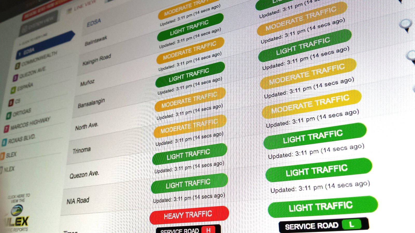
Hosted in Interaksyon.com, I personally find the Line View the most useful of all views – with its linear presentation and color coding of traffic levels, you could easily see the reds.
MMDA Traffic Mirror
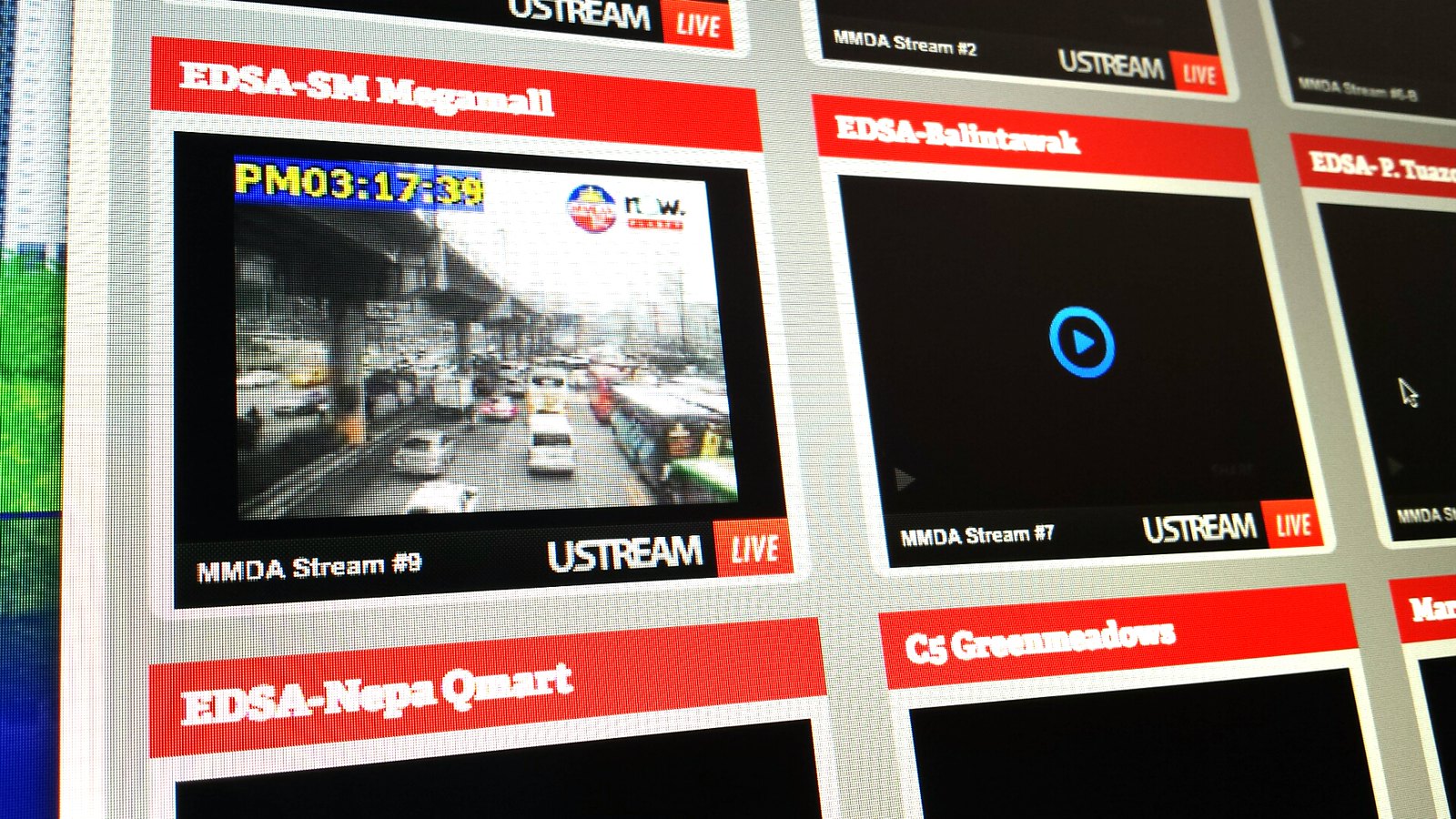
In case you want to see for yourself if a particular area is jammed, there are live traffic monitoring cameras available for online viewing.
Upon reaching the site:
- press “View All Cameras” button (located on top) to activate the play button then
- press play for a specific area
Note: Currently there seems to be a bug if you try to view an area on its own page (this will happen if you don’t press “View All Cameras”).
MRT3 Live CCTV
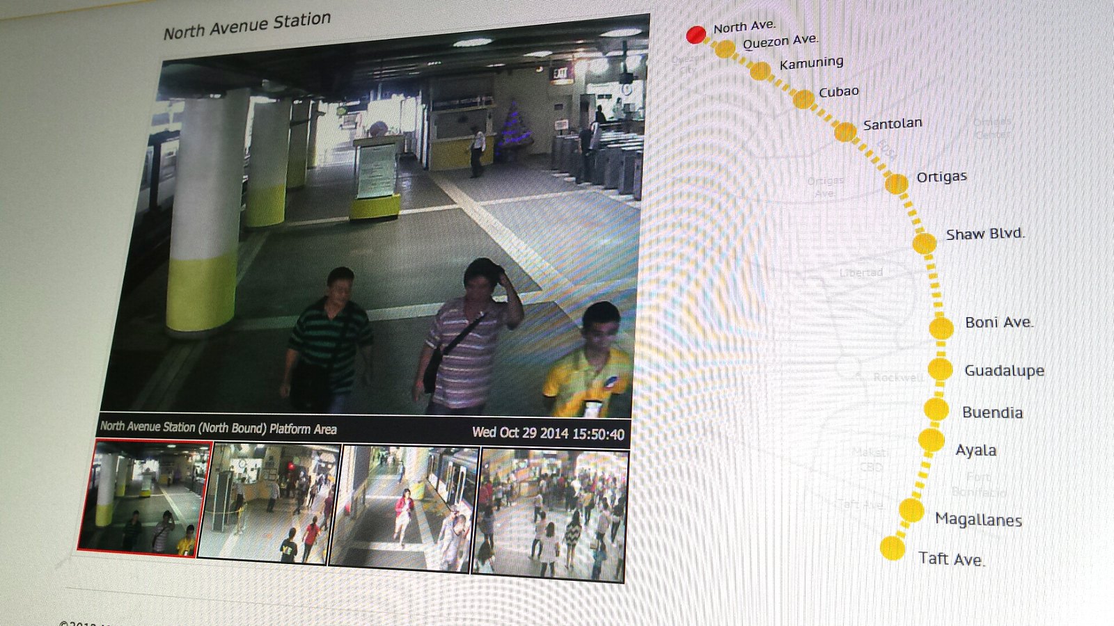
To avoid wasting time standing in long lines at MRT3, check out the situation first via Live CCTV. Sometimes it’s better to take the road than to take the train.
Below the main view of the camera are the other views such as the North/Southbound ticketing and platform areas.
Waze

For other roads and streets not listed via Metro Manila Traffic Navigator, there’s Waze. It relies on its mobile users to report the road condition at their current location. So you could be warned if there are scrupulous traffic officers hiding under a bridge and even find out if there’s saklaan sa may kanto.
While using a connected mobile device…
Metro Manila Traffic Navigator
Waze
It only takes a minute or two to check the status of the roads you’re taking when travelling somewhere. If you’re well-informed, you could save time and even contribute to lessen the influx of people/vehicles in a common route during rush hours.
-
UX and the Philippine Government
I’ve written a short piece on how UX is already rolling here in Philippines, especially in our government.
Personally, I am keen on working on projects that will affect people positively – they could be information or service-oriented web products.
US and UK – Two Great Examples
It’s simple to be like them – they simply
- provide resources and guidelines on how to implement improvements in daily government activities and processes and more important than this is they
- provide access to the information people need or would search for
A step at a time, we could reach the level of developed countries in terms of how they value UX in the government sector.