After building the Content Structure (HTML) of your website, the next step in the process is building its Visuals (CSS).
To be able to ease the process of writing the style sheets, we must segment it into levels:
Level 1: Default (browser level)
Level 2: Normalize (boilerplate level)
Level 3: Modify (visibility and sizes level)
Level 4: Template (functionality level)
Level 5: Theme (custom level)
Ideally, each level must be buildt on top of the previous one yet still independent. For example, leaving the style sheet at browser level must present usable information. The same principle applies as one builds the style sheet level per level.
Level 3: Modify
Related Activities
hide accessible names
hide components
set default state of components thru class names
active element padding
spacings (margins between components and paddings around components)
dimensions are set at 100% for Mobile-First
Level 4: Template
Related Activities
set the functionality of utilities such as Search and Navigation
Level 4: Theme
Related Activities
colors
background colors/images
icons
visual elements (badges, logos, lines/borders, shadows, corner radius)
I’m currently working on HopScotch 3 and it involves a lot of revising the HTML markup of content structure plus a lot of structural class names.
In relation to this HTML refactoring, I’d like to share with you some notes on writing the HTML markup of web sites:
Text. Begin by writing in plain text all the important content your web site has. For example, you might have a web site logo – translate it into words; if you web site has a tagline or description, write that too.
Tag. Follow it up by wrapping each text content in its semantic HTML tag. Avoid using div or span just yet. For example, your web site name should be wrapped in a heading tag like h1 since it is the title of your HTML document; your tagline could be wrapped in a p tag. At this point, all heading tags could be in h1 since we have not put these objects in context yet. Eventually, we would be arranging the hierarchy of these tags – from h1 to h6.
Group. This is where div and span will come into play. You will have to group and segment the objects based on semantics and not on visual appearance. For example, you could wrap both the web site name and tagline in one div.
Classify. Put the class names into the grouped structure of the objects. For example, the div that contains the web site name and tagline could be classified as “web-product-name”. The test for its semantics is if the name is true to the objects’ nature – something that isn’t tied up to visual appearance or layout.
Format. To add another level of semantics and structure to the objects, we could use Microformats. It uses a vocabulary of class names that give structure to common content such as a person’s information, a movie’s information, an organization’s information and much more.
Similar to UI State (which only has active or inactive), UI Condition can be anything to describe the condition of an object.
Example
To denote that an article entry does not have content, we add the class ui-cond__entry--blank which translates to “the UI condition of entry is blank”.
Post in context: I am “refactoring” the existing HopScotch Free WordPress Theme . This is due to several improvements in standardization and content structure.
The example that I will be using is the most common element of web sites – the web site name and description. One encounters this in the form of web site logos and the usually the description is hidden from view.
Here are my notes as I go each step of the front-end design process.
Stages in Front-end Design
HTML
Write the content in text format
write the important information ahead of the less important (which comes first, an item’s name or its thumbnail?)
think of it as words which will only be dictated by voice (like a screen reader)
the information you are writing will be printed on paper (no images, only text in serif)
only include images (icons, symbols) if they need to be translated or described in words, otherwise tackle during CSS stage
e.g., should you write in text “cog icon” to represent it beside the “Settings” link?
elements like <img> has the alt attribute which could contain a description of the image on display – this element, especially if a photo that supplements a text must be included with a <caption>
Markup in HTML
don’t use <div> or <span> (yet)
if a text doesn’t match with any existing HTML element, use <p>
for headings, use <h1> (change later when in context)
add <a> for links and action elements
always link up the web product’s name to the Home view
related: HTML Outline
separate objects and components with one vertical space (return)
Add classes to elements
start with generic class names (e.g., name, desc, axn, comp)
Add HTML attributes
HTML attributes are arranged by id, class, others
add title attribute to <a> elements accessed via tooltip; use it to display supplementary information
add role attribute
Componentize the elements
wrap the grouped elements in <div>generic name of components is “comp”
provide for specific class names in this syntax: specific-name_generic-name for a name grouping, separate with a hyphen (-)
underscore(_) separates the specific from the generic
put comment tag at the end of the component using the specific name
Write the content in text format
HopScotch
Champion of Content Structure
Markup in HTML
<h1>
<a>HopScotch</a>
</h1>

<p>Champion of Content Structure</p>
Add classes to elements
<h1 class="name">
<a class="axn">HopScotch</a>
</h1>

<p class="desc">Champion of Content Structure</p>
Add HTML attributes
<h1 class="name">
<a class="axn" title="Go to Home">HopScotch</a>
</h1>

<p class="desc">Champion of Content Structure</p>
An action and a reaction that goes back and forth between entities is interaction. Here are simple examples of interaction between a user and computer:
you press the power button of your mobile phone and it causes the screen to light up, showing a pass code input screen
you input a pass code and the mobile phone unlocks, showing the home screen
you tap a particular app icon and you are shown its information
It is worth noting that the last item is one of the simplest forms of interaction in web sites and apps – you tap an app icon and it opens or you go to a URL and the web site appears; it presents information and you consume it. Think of link surfing in Wikipedia – you simply activate link after link and consume the information available in the articles.
Of course, added web site or app features provide for more interactions other than purely presenting and digesting information. Take for example 9GAG – instead of textual information, the user could consume textual and visual information, upvote, downvote, comment, and share memes.
Elements of Interaction
The Elements of Interaction aims to categorize the actions of the user while interacting with web sites and apps.
Task
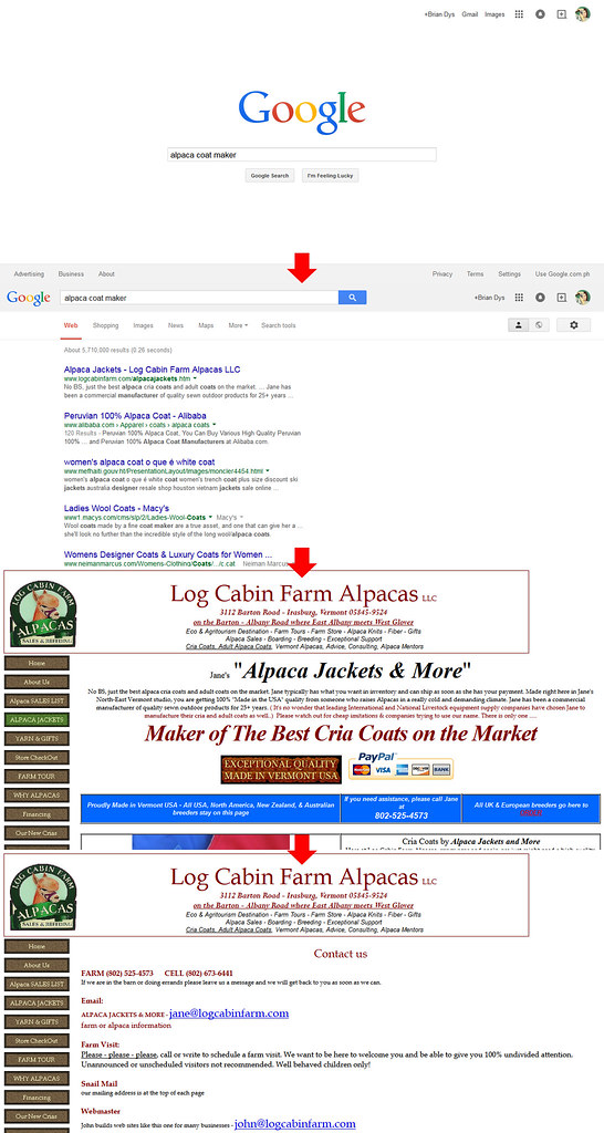
A task is a work done by the user. It is usually direct to the point. For example searching for the keyword “alpaca”. Given that you are already on google.com, this entails inputting the word “alpaca” into the search bar and activating the search button.
Screenshots of google.com showing a task of searching for the term “alpaca”.
Activity
An activity is composed of several tasks. For example, contacting the best alpaca coat maker on the internet. Now, apart from doing the task of searching for the keyword “alpaca coat maker”, there are several tasks entailed in this activity such as reviewing the descriptions of top search results, looking for ratings, trying to visit all top five search results, picking the “best” according to your criteria, and finally, getting hold of them thru any communication channel available (contact form, chat, email, or phone).
Screenshots of google.com and logcabinfarm.com showing the process of searching for the terms “alpaca coat maker” and visiting the top search result.
Behavior
A behavior is a user’s particular pattern of usage of a web site or app. This particular element of interaction creates a space for special cases that varies from user to user.
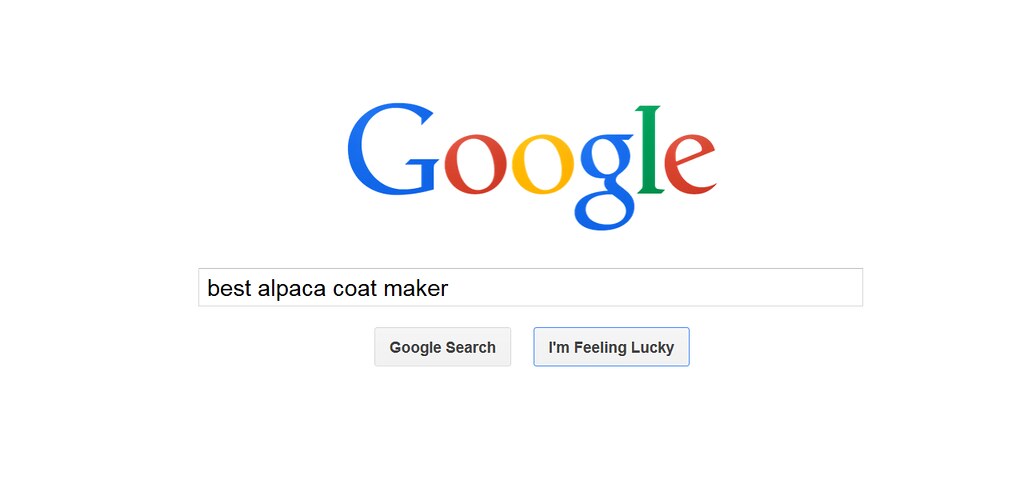
From a low-level perspective, a user might have a peculiar way of accomplishing tasks or activities. From the example above, a user’s behavior in searching might be to go directly to the top result by activating the “I’m Feeling Lucky” button.
A screenshot of google.com showing the button “I’m Feeling Lucky”.
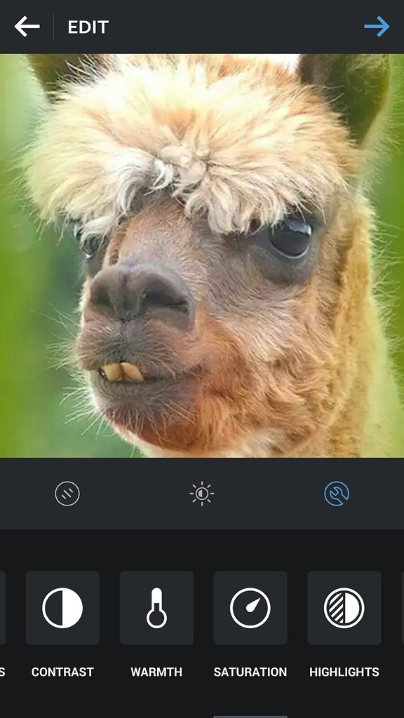
From a high-level perspective, the user might have a peculiar way of using a web site or app which could be not the main purpose of the web product itself. For example, some users use Instagram only for editing pictures but not posting them to Instagram.
A screenshot of Instagram Android app showing the Edit Screen with a handsome alpaca as the image being edited.
Conclusion
The Elements of Interaction puts the context in Elements of Information Structure. It puts the connections among the objects and components in a user interface based on how users might use the web site or app.
In this post, we will discuss Elements of Information Structure. We’ll use google.com as an example to demonstrate how information is structured in such a way that all its elements are identifiable in singles and in groups.
A screenshot of google.com’s home page.
Elements of Information Structure
Contents of web sites and apps can be called “information” – these are words, phrases, symbols, and any representations of elements that give meaning to the user. All information, to be effective, must be properly structured. Imagine a web site that does not show easily the information the user needs – that web site might need to restructure its information by prioritizing the more important ones or what the users usually need.
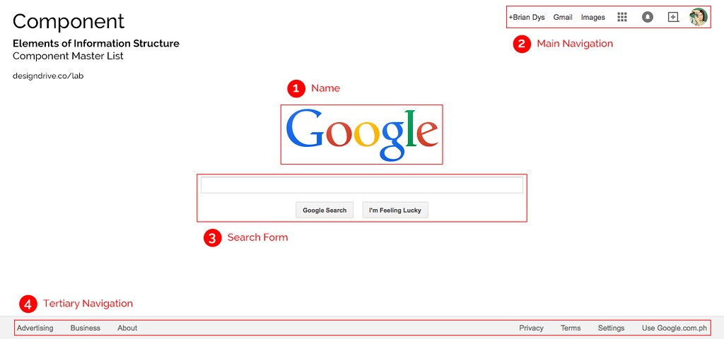
Object
An object is a singular element.
Illustration 1. Objects are highlighted on google.com screenshot.
Note: Some Objects are generalized like in the Navigation Items above. There are several components there (e.g., Apps, Notifications, Social, and Admin) which are listed generally as “Navigation Items”. Ideally, another illustration could show these interactions but for this post, we won’t go into that level.
Component
A component is a combination of more than one object.
Illustration 2. Components are highlighted on google.com screenshot.
Note: Name is considered a Component due to its HTML markup grouping wherein the Name Component could also contain taglines and other objects related to the name of the web site.
Container
A container is a UI element that contains objects and components. Examples of containers are pages or screens, dialog boxes, pop-overs, and panels to say the least. Container is very useful during interaction because it defines the confinements of the information that will be shown or hidden from the user’s view.
Illustration 3. Container type is page.
Constructor
A constructor is a default section in a web site or app. Generally, these three constructors apply to all web products: Masthead, Content, and Colophon. The Masthead contains the name of the web product, the main navigation and search functionality; the Content, well, contains the main content; the Colophon contains additional information of the web product.
Illustration 4. Constructors are highlighted on google.com screenshot.
Sub-Constructor
Updated One example of a sub-constructor is a sidebar which attaches to any of the three constructors. Sidebars are denoted by the HTML tag <aside>. It contains and supplementary information, widgets, and plug-ins.
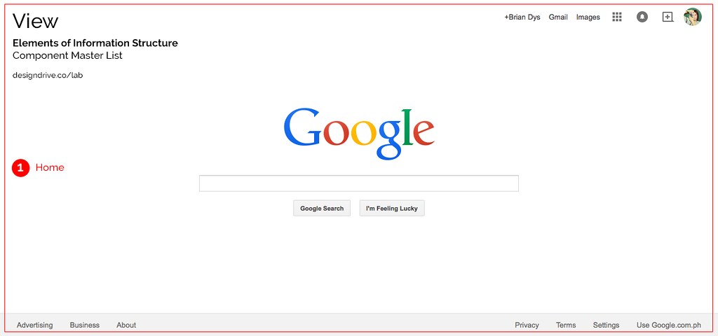
View
A view is an instance of the web site or app. Usually this is also the name of the current page or screen container the user is in. It basically answers, “What page or screen is the user currently viewing?”
Illustration 5. View is highlighted on google.com screenshot.
Conclusion
Each red label in the illustrations above can be used as official names of the objects and components. Team members working on the same project will now have a standard name for components and this could lessen the confusion when referring to the said components.
There are several blog entries in Design DriveThru about the practical application of HTML and CSS, simple ideas as well. In order to put these entries in a clearer light, there needs to be specific categories where they fall under. This will put things in context so that the reader would know to which extent the entry applies to him or her.
For example, as we talk about Notes on SASS File Structure, how does one try to absorb this concept? You might ask if this entry is important for you as a web or front-end designer. The answer can be made easier by categorizing the topics.
Think and Act
The first categories deal with a particular web concept as being either of the two:
Theory
Technique
Theory
Theory deals with general principles.
Theory is a contemplative and rational type of abstract or generalizing thinking, or the results of such thinking. Depending on the context, the results might for example include generalized explanations of how nature works.
There could also be an entry with both Theory and Technique as its categories, for example: Using <body> to Define UI States and Types. This entry talks about principles and demonstrates how to apply it.
Brochure and Kiosk
The second part of categories is about the web being generally split into two – it is either:
web as a document or web as an application
web as hypertext system (information-oriented) or web as software interface (task-oriented)
Web Documents deals mainly with information like Wikipedia or a WordPress blog. This is the primitive beginnings of HTML wherein information are linked to other information via anchor elements.
Webapp
Web Applications deals mainly with services that foster activities and enable the users to accomplish specific tasks. Good examples range from Google Sheets to InVision.
This category set could be mutual like Flickr, for example – it is a webapp yet it deals with images and videos with rich information.
I would be using these categories to contextualize entries mostly discussing HTML because each web object, whether a simple web document or a webapp deals with HTML.
Conclusion
Hopefully this categorization technique will be useful in mapping the context of Front-End Design entries.
How would you be able to affect the main navigation depending on the state of the search form if its class is only confined within its container? The answer might be “thru JavaScript” – undeniably, we would need JS in this topic but only for manipulating class names. The trick lies in putting the UI Type or UI State class in a place wherein both main navigation and search form are under it.
Why <body>?
What benefit do we get in having a globalclass located higher in the DOM tree? It lets us control different parts of the UI depending on the site’s or app’s UI Type or UI State.
It is important to reserve the highest element you can put a class on – which is html (for pertinent class names), thus, the second highest element we could attach a class attribute to is body.
Going back to our example, we would use the following UI State class to define the state of the search form:
<body class="ui-state__search-form–active">
The body class, in words, translates to “The UI State of the Search Form is Active”.
Now, whenever the search form is active, you can already manipulate the main navigation based on that state.