Author: Brian Dys

  • When a Country Values UX

    …it has a Usability.gov website! Well, it’s an initiative and there is lot more ways UX could be manifested. In Philippines, UX is in its birthing process. First of all, we have:

    User Experience Philippines Design Conference

    We’ll be having our first UX design conference by UXPH.

    UX Philippines

    UXPH 2014 aims to inspire designers, developers enthusiasts to learn more about improving the human experience while adding business value. This conference is for anyone who wants to learn what UX is and how it can make a difference in company’s products and services.

    Source: User Experience Philippines

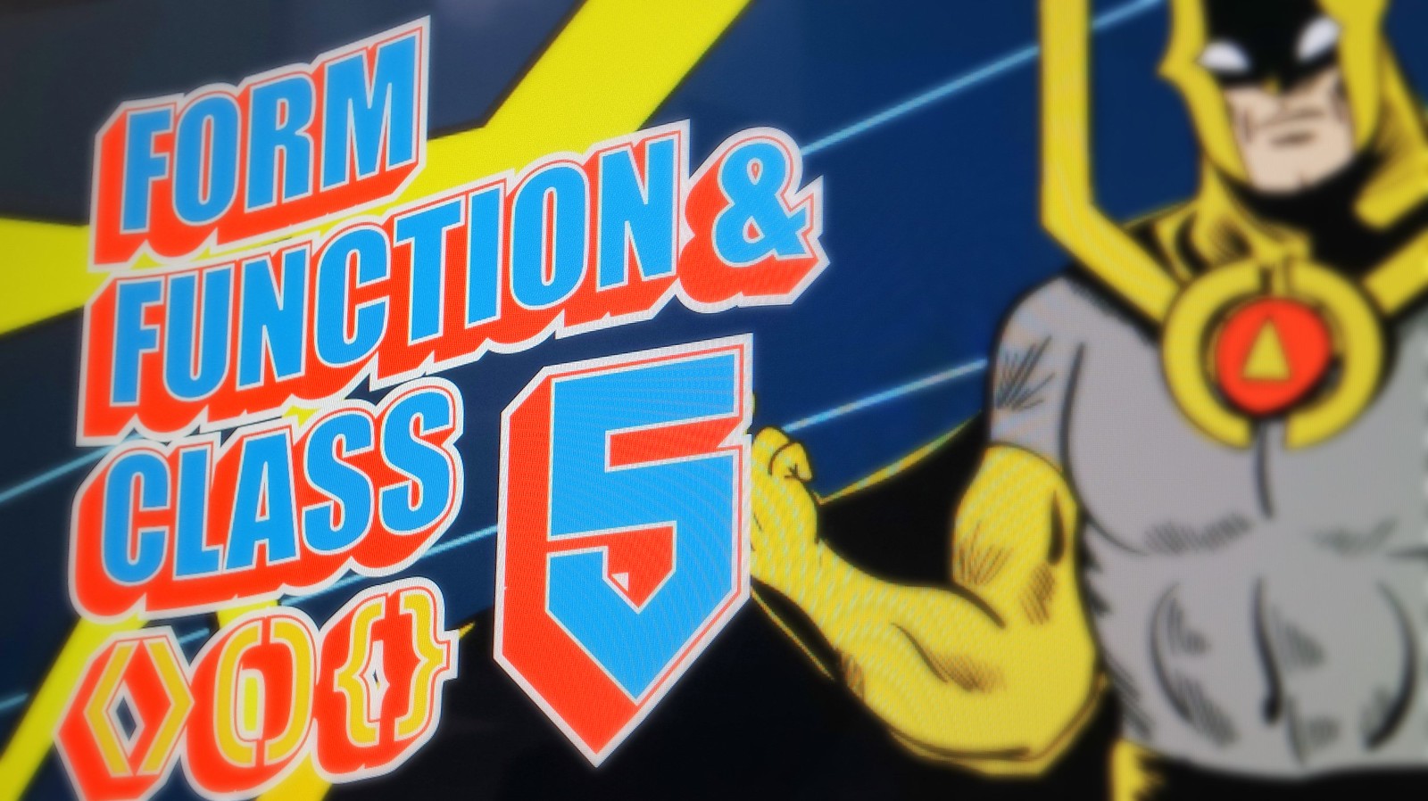
    Form Function & Class

    In its fifth year, FFC Web Design Conference continues to impart essential knowledge to the web design community. It is organized by Philippine Web Designers Organization.

    Form Function Class 5

    We are a group of enthusiasts and professionals who create human interfaces for the Web, champion the use of standards, accessibility & usability, and aim to uplift the state of web design in the country.

    Source: Philippine Web Designers Organization

    What about in the government, what are we doing about UX? The ball is already rolling!

    Republic Act No. 10557

    Philippine Design Competitiveness Act of 2013

    I first heard this initiative at Grafika Manila 2011 – dubbed as “Design Para sa Lahat,” it sparked a new hope in me that the government is keeping up with the times. Imagine creativity in the government? Yes.

    It is the declared policy of the State to enhance the competitiveness and innovation of Philippine products, create market-responsive design services, while advocating for economic and environmental sustainability. The State shall also endeavor to promote an economy and society driven by design and creativity responsive to our fast-changing times and reflective of the Filipino culture and identity, while concurrently advocating the protection of intellectual property rights to these ideas and innovations.

    Source: Official Gazette of the Republic of the Philippines

    Government Website Template

    We already have the initiative to improve the overall usability and experience of government websites thru the Government Website Template.

    Through the standardized websites, Local Government Units, National Government Agencies and State Universities and Colleges will experience ease in navigation and use of digital assets. More than that, content, news updates, public documents and other services will be easily accessible to the citizens, especially for those who use mobile devices such as smart phones and tablets.

    ~ Antonette Torres, iGovPhil Project Manager

    Source: Information and Communications Technology Office

    What can we do to help our country?

    As we are going towards a stronger economy, UX is undeniably a helpful tool for the government to effectively reach out to people. There are very simple ways to contribute to this development (aside from voting wisely and paying our taxes):

    • Join discussions about the web design & development and UX industries. Philippine Web Designers and Usability Philippines Facebook Groups are good places to start.
    • Balance negativity with positivity. It’s very easy to succumb to bashing on the faults that our government fails to rectify but since we’re all in this (country) together, be the one who thinks and acts for a solution.
    Proposed Warning Sign
    UX will do its part but you also do your part.

    Resources

  • Visual Vocabulary for Information Architecture

    2014-10-27 20.45.32
    A photo of an actual Interaction Diagram.

    In our team, we have something called an Interaction Diagram integrated into our Design Process.

    Basically it is a collection of wireframes in context – whether of the whole web product or of a simple task or activity. The diagram shows the layout of components as well as their interaction with other components.

    We’re using it consistently as part of our communication with web and app developers. It has proven to be very useful since its inception a year ago (October 3, 2013).

    2014-10-27 20.30.13
    A photo of Visual Vocabulary webpage.

    Jesse James Garrett’s Visual Vocabulary for Information Architecture is one of our main references in establishing the Interaction Diagram.

    Authors of the Interaction Diagram:

    • Michelle Villanueva
    • Brian Dys Sahagun
  • Designer Who Codes, You’re Special

    During the heyday of IE6, frontend design was in murky waters. The frontend designer would need to employ lots of hacks, patches, and workarounds just to achieve the look and feel of a grand mock-up. Remember:

    • when we used table for layout?
    • when we used a 1×1 transparent pixel as spacer image?
    • when we exported images as masks to make rounded rectangles?
    • when we used images as gradients?
    Table vs CSS
    CSS knocks-out the table.

    These were just a minute part of the painful challenges frontend designers faced yet nothing stopped us from adapting to the crappy non-standard browsers of that time. We moulded the web into different appearances despite the difficulties. Remember the time:

    • when pixel fonts were in?
    • when DHTML was so fancy that sites had snowflakes falling on them and cursors were customized with trailing stars?
    • of “Web 2.0” – the proliferation of badges, loading icons, fab aqua buttons?
    • of letterpress typography?
    • of minimalism?
    • when full-screen images is the template of all websites?
    (more…)
  • An Example of a Technical Document

    Consider this scenario:

    • you are the product owner of Siete Baracos (a tool that helps people with coffee measurements and ingredients)
    • how will you inform the designers, developers, testers about the basic technical information of the product?
    • thru a Technical Document, of course!

    So here’s the basic format of the document:

    Name: Siete Baracos

    Description: Siete Baracos is a tool that helps people in making coffee thru measurements and ingredients.

    Platform: Web

    • Purpose: Brochure

    Browser

    • Primary Device: Desktop Computer
    • Secondary Device: iPad
    • Lowest Browser Version Supported: IE 8
    • Mobile Response: 768 px

    Framework

    • Bootstrap

    Other examples:

    • Template System (Python, PHP)
    • CMS (WordPress)
    • HTML (Bootstrap, Foundation, Web Starter Kit)
    • None (Plain HTML)

    Platform: Android

    Device

    • Primary Device: Samsung Galaxy Y
    • Secondary Device: Any
    • Lowest Version Supported: Froyo (2.3)

    These basic information of the product acts as guideline and sets the context in which the product revolves around.

    Now, team members will not blindly test the app using a device lower than the version stated.

  • 6 Years Ago

    Chikka Text Messenger Desktop Client Mock-ups 2008
    Mock-ups of Chikka Text Messenger Desktop Client in 2008. Design by Brian Dys Sahagun, © Chikka Philippines Inc.

    October 2008

    It was a very early morning at 10 a.m. I was half asleep, half awake when a phone call jolted me from sleepiness. The signal inside the apartment was so weak that I went outside to answer the call. It was an invitation from Chikka for an interview.

    A mere seven months ago, I resigned from a night-shift job and ventured onto the mountains – equivalent to working freelance without a clear business plan. The offer from the other line was a real wake-up call for me to set focus once again into designing for the web. The position being offered was quite new to me – User Interface Designer. I said that as long as it’s on a senior level, I was interested.

    (more…)
  • Technical Document

    Web products need to be supplied with a Technocal Document. Its content are the basic specifications of a mobile app or website in the following aspects:

    Filled-up by developer

    • Programming Language

    Filled-up by product developer

    • Browser Version Support
    • Mobile Version Support

    Filled-up by front-end designer

    • Mobile Response

    This document aids all team members involved in the project by providing with a preview of each team’s specifications. It also puts in context the capabilities and limitations of the product.

    Consider this scenario:

    • the mobile app is in its Behavioral Testing stage
    • the tester is informed that the mobile app is supported under a very old version of Android
    • the tester ensures that the mobile app is tested on all key versions of Android

    The same goes for websites wherein each team member knows that the product will not be supported in IE versions 8 and below.

    See an example of a Technical Document

  • Conducting a UI Review

    A UI Review is a testing methodology conducted by a designer (UI/UX/Front-end) on web products prior to Usability Testing.

    The first aspect to be reviewed is visual design and the second is usability.

    This is conducted primarily to ensure that the obvious negative findings in a Usability Testing are lessened.

    Consider this scenario:

    • a working mobile app is available for testing prior to production (launch)
    • a designer will conduct a UI Review
    • the reviewer will take note of visual design inconsistencies and usability difficulties
    • the designer will revise the design based on the findings
    • the mobile app is ready for Usability Testing

    It is recommended that a UI Review is conducted on a working product rather than on a prototype or mock-up because this puts the reviewer in the context of actual usage and not just a replicated one.

  • Working with Chikka Design Team

    Karin Alody Chan was part of Chikka Design Team as front-end designer. She has graduated from the position and currently pursues web design. This is her essay from an exit interview.


    Working with Chikka Design Team has given me an opportunity not just to grow in terms of career but also with personal development.

    Before I started working at Chikka, I didn’t have any confidence with my design and front-end skills because I know that I was a bit behind with all the new stuff that has been going on with the design industry, but because I’m passionate with what I do, I decided to challenge myself to be open to new things.

    Everyone in the team has their specialization and common knowledge when it comes to UI/UX but this didn’t hinder them to learn new things and make design as a lifestyle. I like that we’re open to discussion and our team lead wants us to be innovative. I felt like I was in college because of the environment – in college we were trained to have the courage to talk about our design ideas and  be able to defend our designs – like every detail should have a purpose and not just design something and put it in an empty space as filler. That’s what I felt with the team.

    I am grateful that I was part of it. What I learned is that being humble is the most important thing you need to have if you’re working for a company because we learn to admit to ourselves that we’re not right all the time. I know there were times that maybe I try to defend my designs too much but it has taught me that sometimes it’s okay to just listen and accept other people’s perspective.

    I think that this is, so far, the best team I have ever been to. I hope everyone the best of luck in the near future.

  • Notes on User Research

    User Research

    • Input – research and requirements; output – design artifacts, actual product
    • How did we come up with the problem and solution?
    • Have one solution and validate with users
    • Set target users; create personas
    • Continuous user research
    • Improve the product for both the business and the users

    UI Review/Usability Testing

    • Refer to Components Masterlist
    • Refer to Usability heuristics
    • Create metrics
    • Create activities and tasks
    • Create directions on how to assume a persona
  • Garage Selling: OLX and Tackthis

    OLX vs Tackthis
    A graphical representation of Tackthis and OLX websites.

    I’m in the process of letting go/disposing of/getting rid of/selling stuff that I no longer need around the house. In line with this activity, I signed up for two online shops, namely: OLX and Tackthis. Both offer free registration so I went on to set up my online shops.

    Just a disclaimer, this blog post does not intend to rigorously compare the two services – I would simply like to document my experience as a user/seller – specifically the noticeable stuff whether positive or negative. Also, this could be an ongoing piece of “review” as I go along with this new adventure of garage selling on the internet.

    (more…)